

Webforms have always been a vital ingredient in the World Wide Web cocktail; Humans need an easy and practical way of converting their thoughts into structured data and forms do exactly that. Through the use of various field types, webforms allow users to provide information such as completing surveys or submitting inquiries and support all kinds of interactions like registrations and purchases.
In this tutorial, we'll be using Drupal's interface and one of its most widely used contributed modules, Webform. The same high-level principles apply to WordPress or any other modern website-building platform.
In this Episode...
We'll be using one of our active Drupal projects but the same principles apply to any Drupal website you have installed locally or hosted on a Cloud-based server.
You can always use the tutorials listed below to create your first Drupal website locally as well as push its codebase to a Bitbucket repository and deploy it to the Cloud before returning to this post to continue with the project:
- LocalGov Drupal Tutorial #1: Local Installation with Lando
- LocalGov Drupal Tutorial #2: Local Installation with DDEV
- LocalGov Drupal Tutorial #3: Version Control and Code Repository Setup
- LocalGov Drupal Tutorial #4: How to Deploy Your Website to the Cloud
The following articles are also available with detailed information on Drupal's features:
- Drupal 10 features (Drupal 11 is now released but D10's features are still relevant)
- Drupal 10 upgrade guide
- Drupal 11 features
- Drupal SEO modules
Let's dive straight into it!
The Webform Module: Introduction
It would be an important omission if we didn't mention Jacob Rockowitz, the creator of the Webform module. He started building and maintaining the current version of the module in 2015. One of the things he's mostly proud of is the community-built Webform add-on modules that represent the worldwide impact of his work.
Now, let's dive into the world of the Webform module! From the Webform module's project page on Drupal.org:
The Webform module provides all the features expected from an enterprise proprietary form builder combined with the flexibility and openness of Drupal.
Still on the module's project page, a list of features the module comes with is presented below:
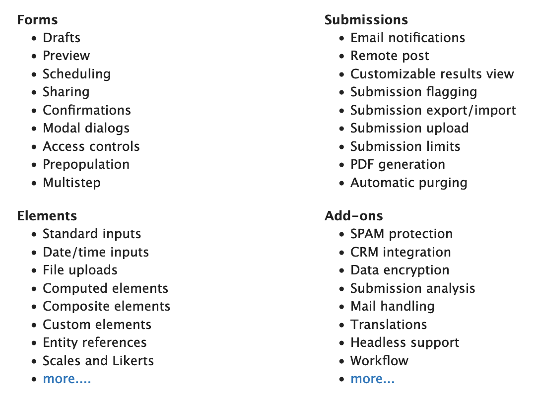
These lists merely cover the primary functions the Webform module provides and it would probably take a whole booklet to mention every feature available. But fear not! You don't have to be a Webform module expert to be able to put your first form together. Read on for a detailed guide on how to build your first Drupal form...
Webform Module Installation
1. Adding the module to our project
1.1. Using the Drupal UI
Drupal provides an easy and accessible way to add a new module to your project. This method doesn't involve Composer and it's not recommended if you're working on a commercial project where all dependencies and packages have to be tracked (if that's the case, skip straight to the Composer method below).
Under /admin/modules/install, the "Add new module" screen is available:
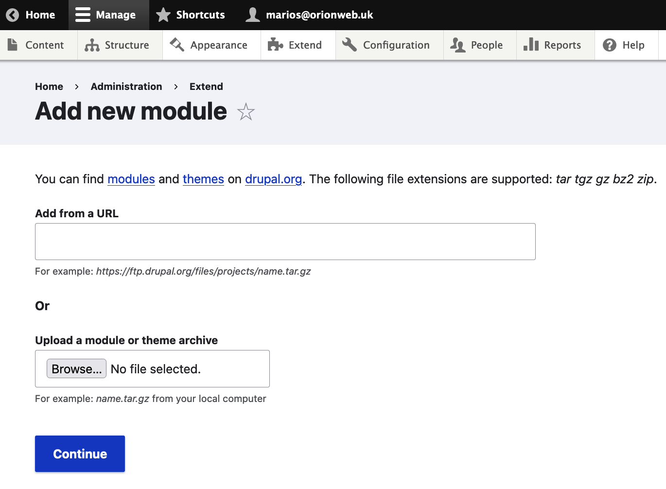
This page allows you to add a module to your project using its compressed files' unique URL. You can also directly download the module's .tar.gz code from its project page https://www.drupal.org/project/webform and then use the "Upload a module or theme archive" field on the module addition page to upload the module's files.
Still on the module's page, scroll down to reach the Releases section, then click on the latest stable release for your version of Drupal (you should be using Drupal version 10.x at the time of writing):
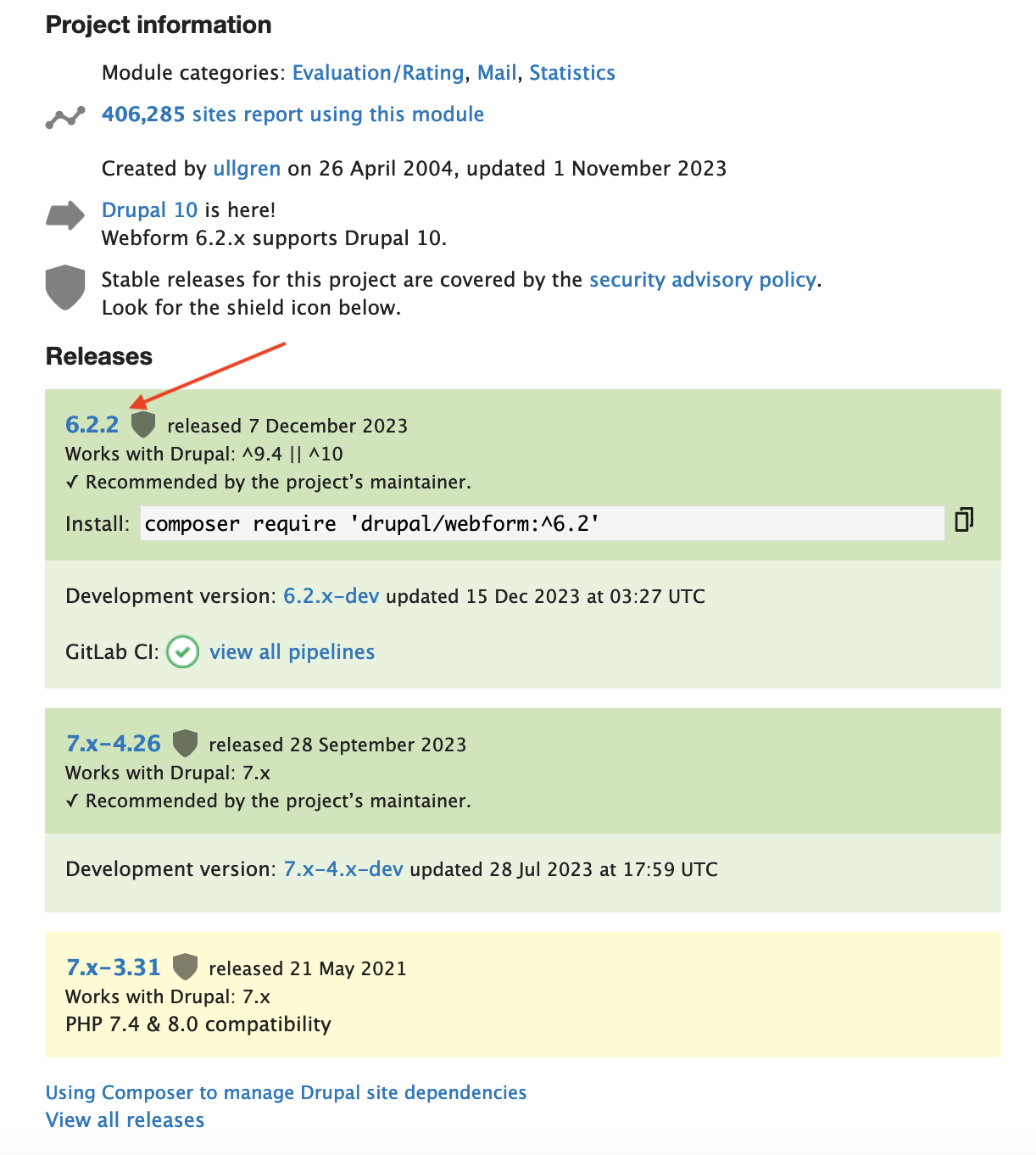
You should then be directed to the unique URL for that release (something like https://www.drupal.org/project/webform/releases/6.2.2) where you can find the tar.gz link URL, something like https://ftp.drupal.org/files/projects/webform-6.2.2.tar.gz:
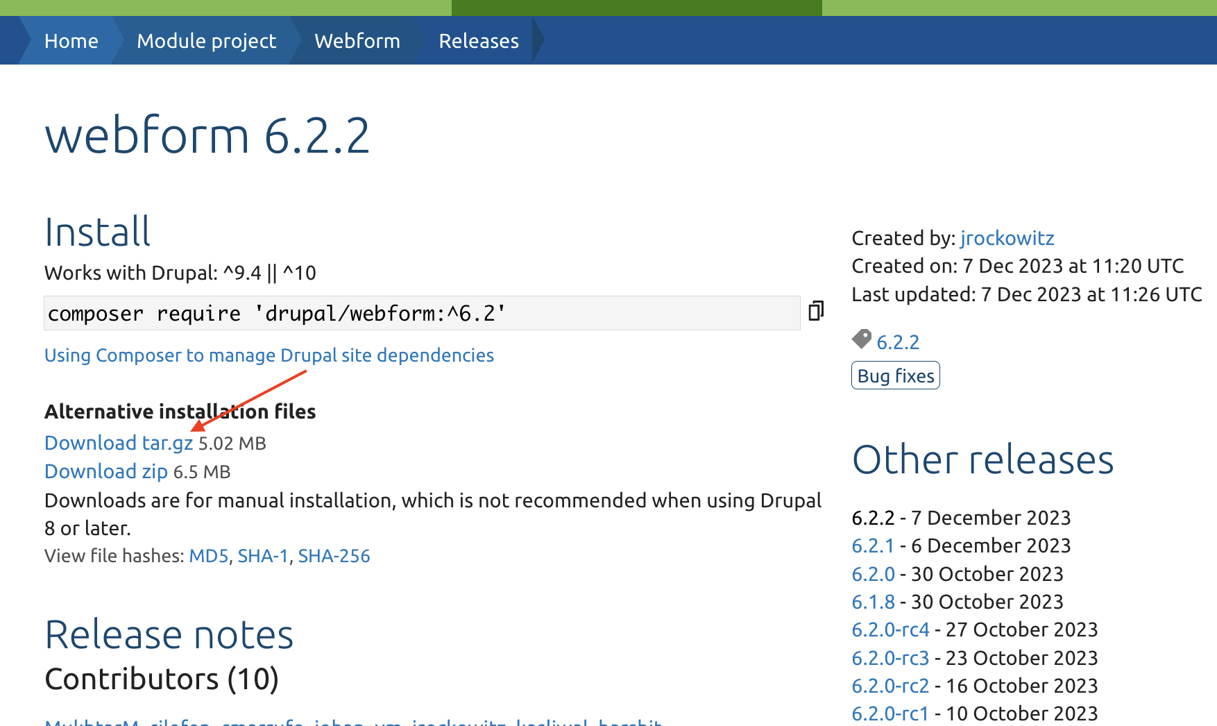
You can now use this URL on the module addition page above to install the latest version of the Webform module.
1.2. Using Composer
The recommended and most common method of adding a new module is via Composer, Drupal's dependency manager. This method ensures that all the dependencies of your project are documented with their installed versions as well as their own dependencies. If you have been following our previous LocalGov Drupal tutorials, you should already have Composer installed on your machine. If not, you can go back to our LocalGov Drupal Tutorial #1: Local Installation with Lando tutorial and follow the instructions in the corresponding section.
Open up your Terminal/Command Prompt/Shell and type the following command in your project's root folder (the latest stable project version might have changed since the time of writing this):
composer require 'drupal/webform:^6.2'2. Enabling the Module
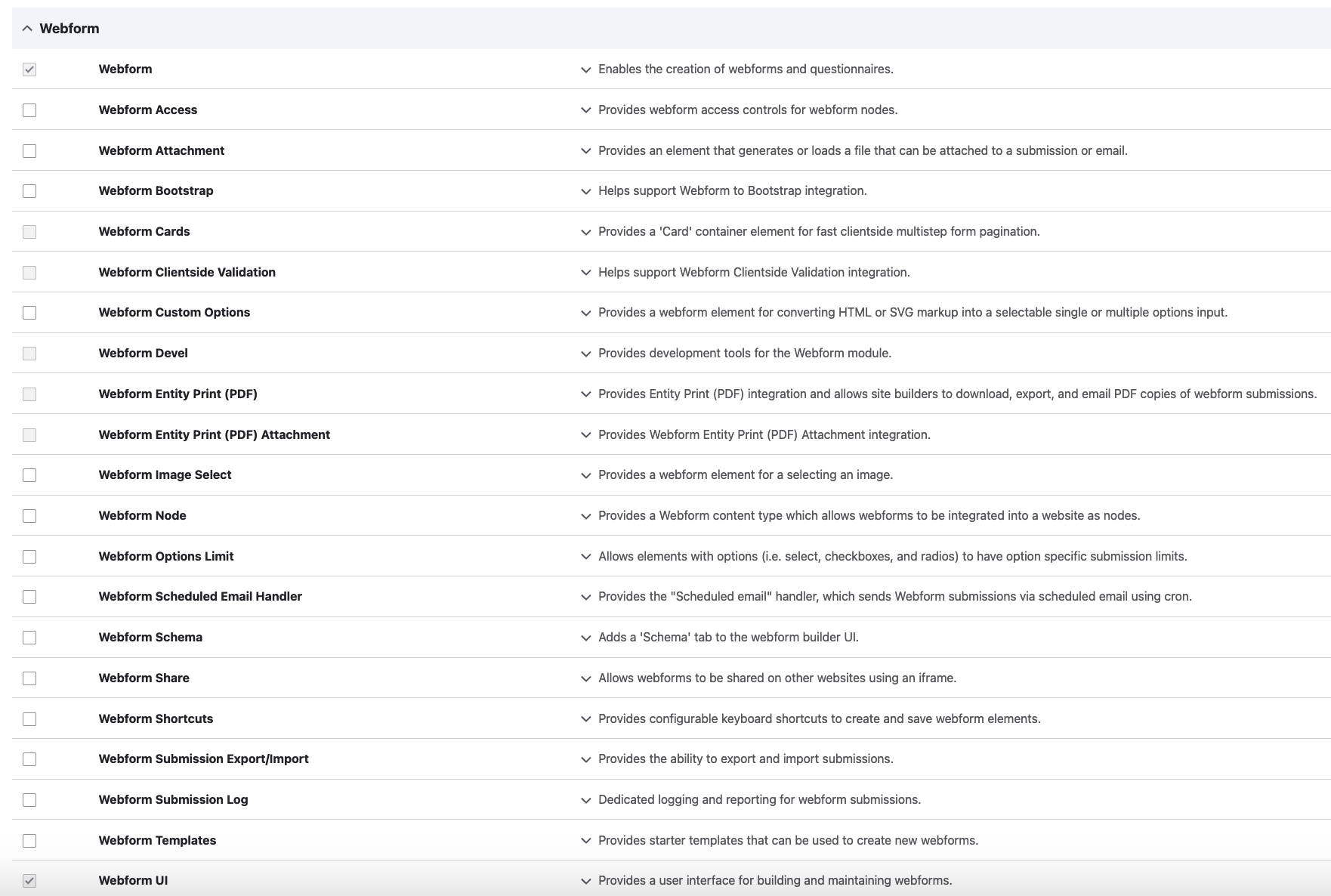
To be able to use the module, we also have to enable it. You can do that on the Drupal UI by visiting /admin/modules (in the screenshot below, we have already enabled the main Webform module as well as the Webform UI sub-module which allows us to configure the module on the Drupal UI):
Alternatively, you can enable the module via drush (we are using DDEV to run drush for this example but you can also use the equivalent Lando command if that's how you've set up the project locally):
ddev drush en webform3. Exporting Configuration into Code
After enabling the module, we can also export all related settings to configuration i.e. in code. To do that, we run the corresponding drush command:
ddev drush cexThe same step should be repeated whenever we change any configuration settings around the Webform module (or any other site-wide settings) to make sure that our code is always up-to-date. This (as well as the next Git version control step) is essential in deployment workflows where every code deployment/release comes with a configuration import step. That way, if you apply any configuration changes on any environment (that could be the live site, for example) and you export all of these changes into code (locally, for example), nothing will get overwritten when a deployment imports the configuration back to the website. You can read more on Drupal's Configuration Management here.
4. Updating our Remote Code Repository
If you're maintaining your project on a remote repository, you can commit and push your code changes:
git add -Agit commit -m "Adding and enabling Webform module"git push origin master(master is the main branch used for this example but it could be a different branch in your case.)
Now that we have added and enabled the Webform module, we are ready to explore its rich features!
Webform Module Permissions
Under /admin/people/permissions#module-webform, you can review and set up permissions for all webform-related actions and tasks, per user role:
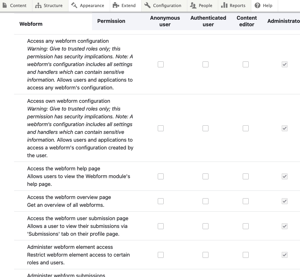
There are numerous permissions under the Webform section on this page which allow you to fine-tune what each role can do. If you're implementing a content moderation workflow with various content editor roles, publishing states and transitions between publication states, you'll find yourself making more use of the module's permissions. On the other hand, if you're working on a simpler project, with a minimum amount of users logging in for administrative tasks (it might as well be just you), you'll most probably not have to change much (if any) on the permissions page for this module.
Global Webforms' Configuration
Below, we are presenting the main screens that come with the Webform module:
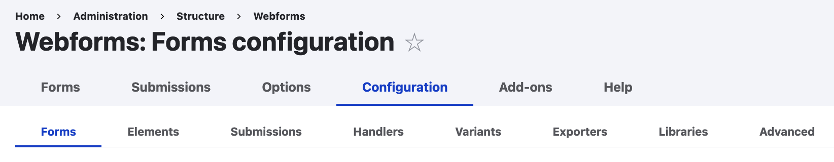
1. Forms (/admin/structure/webform):
Navigate to Structure > Webforms or type the page's path directly to access the main screen:
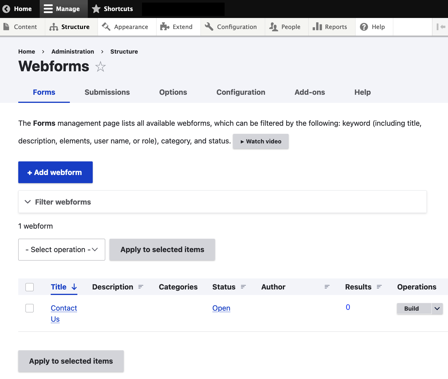
Here, all the available webforms are listed along with some useful information:
- Title: This acts as the administrative title of the webform as well as the webform page title (if you are displaying a webform on a certain path, more on that below).
- Description: In most cases, simple webforms wouldn't need any description but, on websites with a large number of forms, an accurate description can help admin users quickly locate the webform they're looking for.
- Categories: The Webform module used to allow for only one category. In the last versions of the module, it's possible to assign a single webform to multiple categories at the same time.
- Status: This can be set to either Open or Closed. Form status applies to all instances of this webform. For example, if this webform is closed, all webform nodes and blocks will be closed and users won't be able to use your form on the front-end.
- Author: This is the Drupal user who created the form initially. For the default Webform, there is no Drupal user assigned as it was automatically generated upon enabling the module.
- Results: This is the number of submissions. In our case, the default Contact Us form has received zero submissions so far.
- Operations: This menu provides various self-explanatory administrative options:
- View
- Test
- Results
- Settings
- Duplicate
- Delete
2. Submissions (/admin/structure/webform/submissions/manage):
This leads to the Submissions screen where you can access and manage (purge, for example) all the previous submissions for every Webform.
3. Options (/admin/structure/webform/options/manage):
The Options configuration page lists reusable predefined options/values available for select menus, radio buttons, checkboxes and Likert elements. For example, the Days element looks like the following:
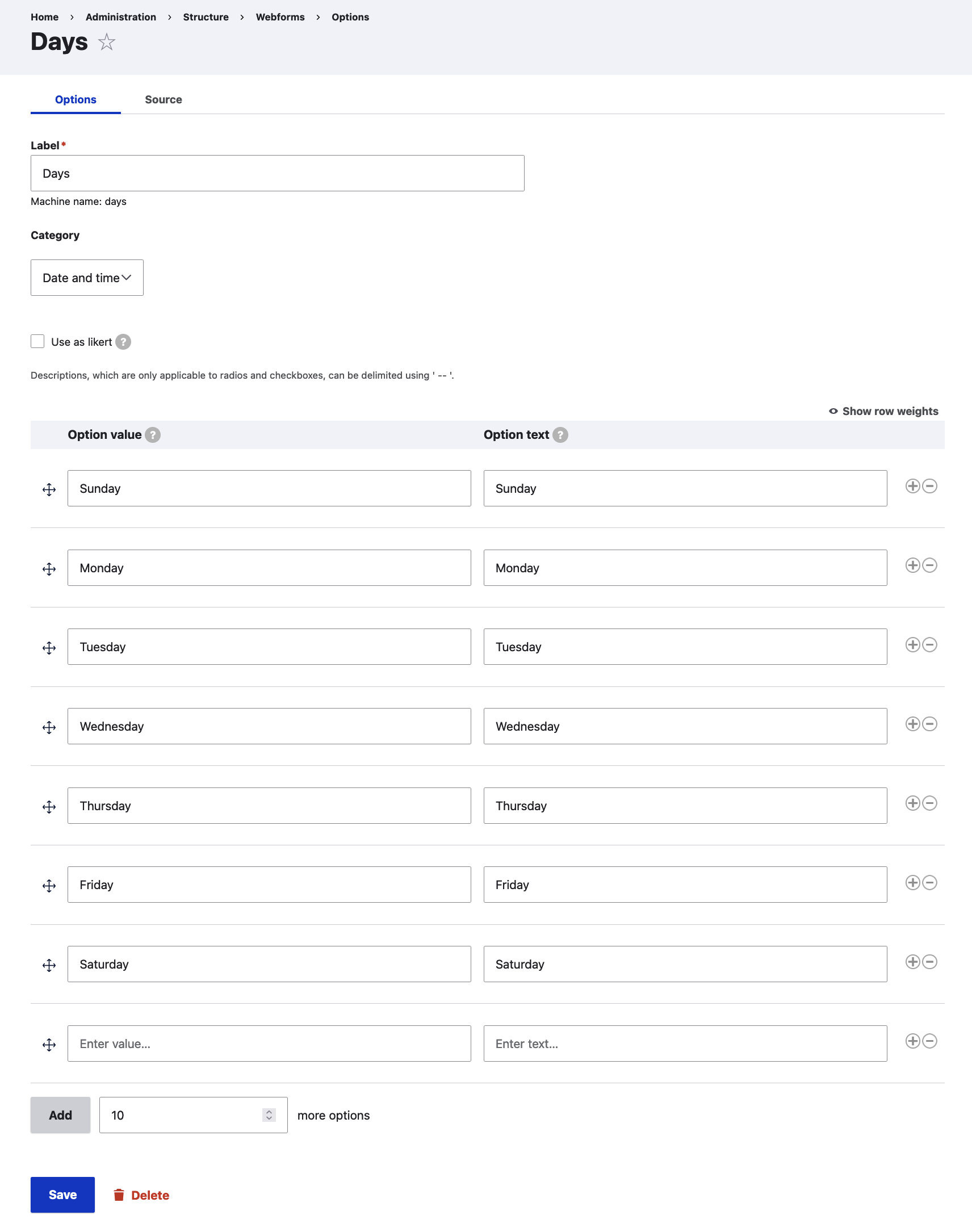
You can edit all available presets to your liking and also maintain your own bespoke options library.
4. Configuration (/admin/structure/webform/config): This is the global configuration settings page and applies to all Webforms on your site.
These screens provide a plethora of settings, including:
- Forms configuration page (/admin/structure/webform/config): This page allows administrators to manage form settings, behaviors, labels, messages and CSS classes:
- Default status for new webforms (Open/Closed)
- Default messages for various scenarios (e.g. access denied message, closed form message and more)
- Default submit button label
- Form CSS classes (you can add your own CSS styles here)
- Form behaviours (e.g. prevent duplicate submissions, disable the back button, disable client-side validation etc.)
- Form preview settings
- Form submission confirmation settings
- Form AJAX settings
- Bulk operations settings (this applies to the Operations menu above)
- Third-party settings: These allow contributed (e.g. Antibot or Honeypot) and custom modules to define global settings that are applied to all webforms and submissions
- Elements configuration page (/admin/structure/webform/config/elements): This page allows administrators to enable/disable element types and manage element specific settings, properties, behaviours and formatting.
- Submissions configuration page (/admin/structure/webform/config/submissions): This page page allows administrators to manage submissions settings, behaviours and messages.
- Handlers configuration page (/admin/structure/webform/config/handlers): This page allows administrators to enable/disable handlers and configure default email settings and messages. Handlers are used to route submitted data to external applications and send notifications and confirmations.
- Variants configuration page (/admin/structure/webform/config/variants): This page allows administrators to enable/disable variants. Variants are used for A/B testing, segmentation, and personalisation.
- Exporters configuration page (/admin/structure/webform/config/exporters): This page allows administrators to enable/disable exporters and configure default export settings. Exporters are used to export results into a downloadable format that can be used by MS Excel, Google Sheets and other spreadsheet applications.
- Libraries configuration page (/admin/structure/webform/config/libraries): This page allows administrators to enable/disable libraries and define global custom CSS/JavaScript used by all webforms.
- Advanced configuration page (/admin/structure/webform/config/advanced): This page allows an administrator to enable/disable UI behaviors, manage requirements and define data used for testing webforms.
5. Add-ons (/admin/structure/webform/addons):
The Add-ons page lists Drupal modules and projects that extend and provide additional functionality to the Webform module and Drupal's Form API. You can find hundreds (251 at the time of writing this) of different modules on this page as well as links to their dedicated Drupal project pages.
6. Help (/admin/structure/webform/help):
The Help page (/admin/structure/webform/help) offers a useful selection of links to tutorials and documentation pages around the Webform module, its functionality as well as integrations.
Creating a Webform
At the bottom of the Forms page (/admin/structure/webform), you can see a default "Contact Us" form listed. This webform was automatically created when we enabled the module (but we have since changed its title from "Contact" to "Contact Us"). You can use this contact form as is or configure it further according to your needs. Alternatively, you can delete this webform and create your own from scratch. For the purposes of this tutorial, we'll be adding a brand new webform to our website.
Clicking on the "+ Add Webform" button reveals the following popup dialogue box (we have populated the fields with some information already):
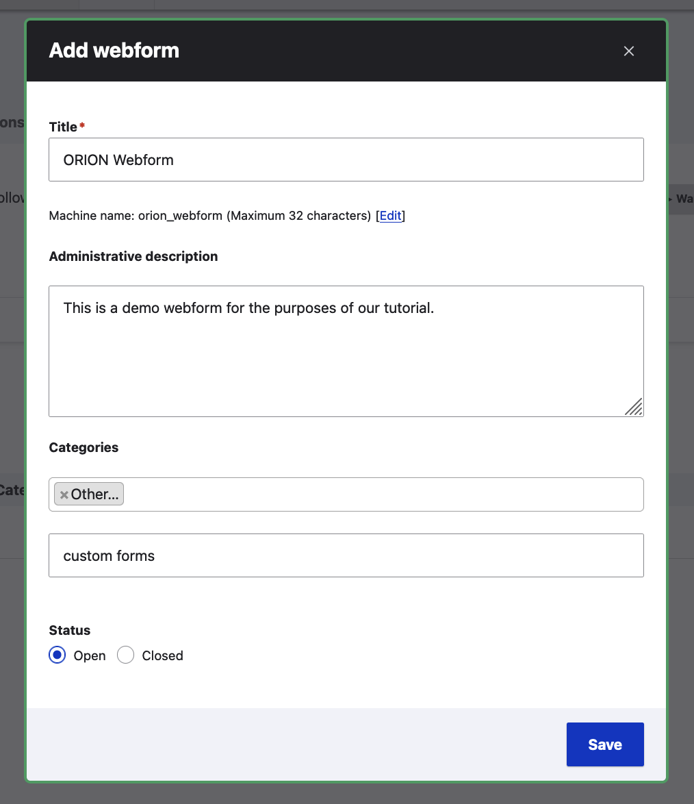
In the Categories field, we have selected Other but also added a new category, "custom forms".
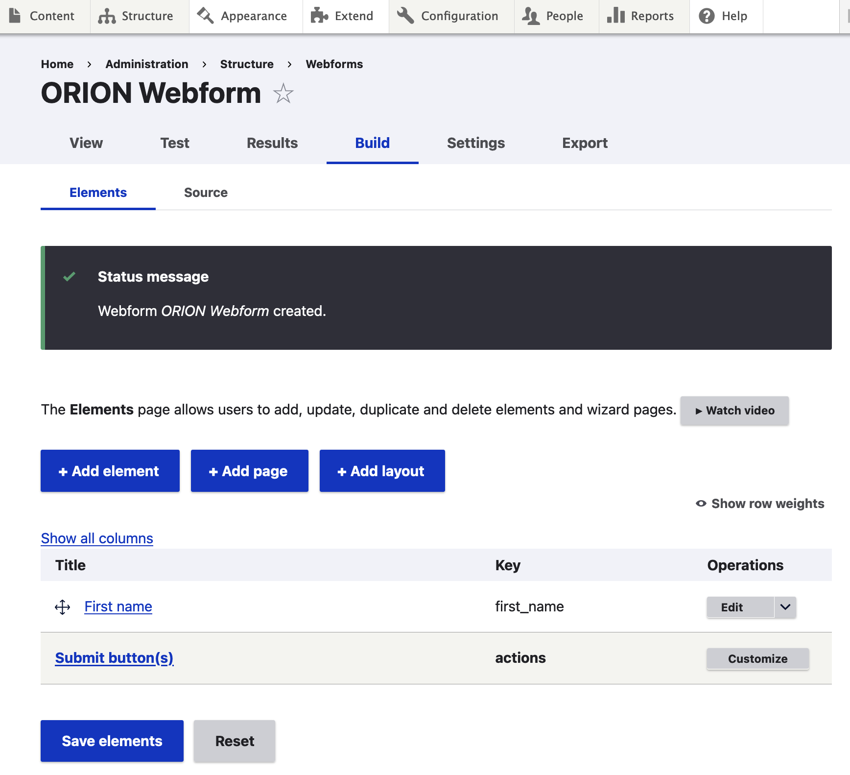
Upon clicking "Save", our new ORION Webform is created and we are redirected to its dedicated screen (/admin/structure/webform/manage/orion_webform):
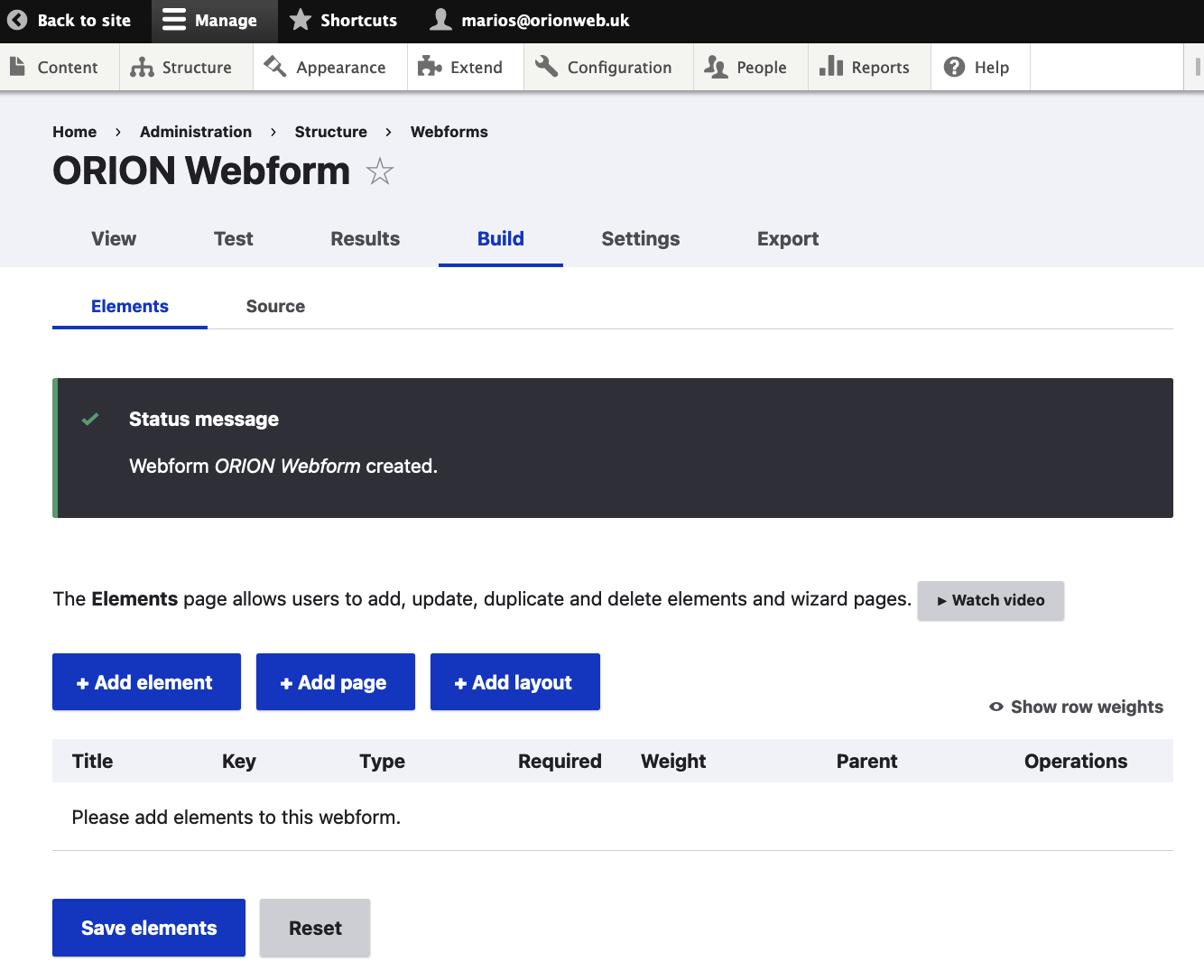
Adding a Webform Field (Element)
The webform is there but it has no fields so let's add some! Click on the "+ Add element" button to select a field type to add to the Webform. As you can see, there's a huge number of field types available (for the sake of the screenshot we have closed all the available field groups apart from the first one, Basic elements):
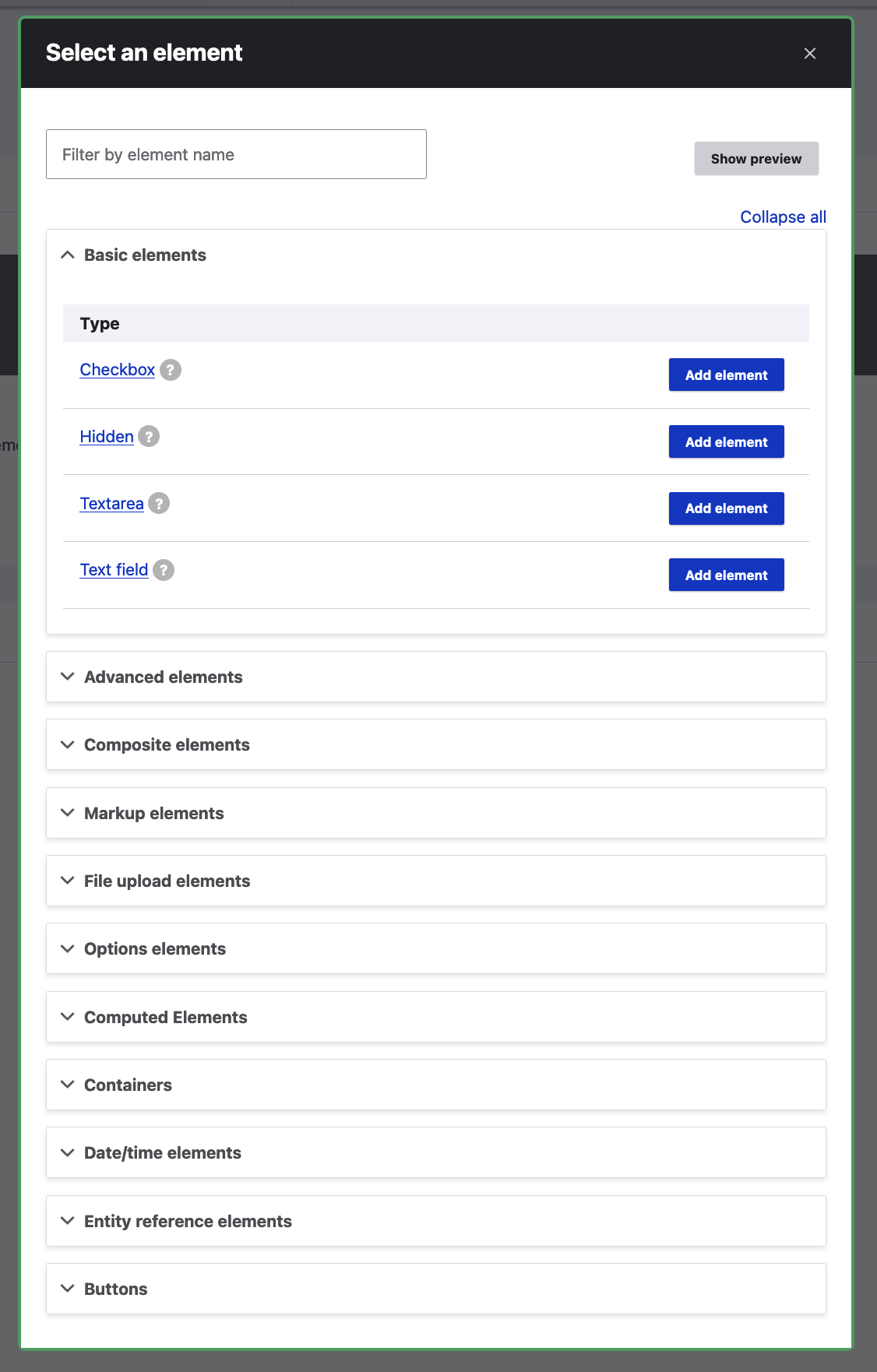
We are going to add a humble text field for a start. Upon clicking on "Add element" next to "Text field", we are presented with the "Add Text field element" side dialogue box which consists of several tabs. The same tabs are also available for existing fields we've previously added so don't worry if you realise you've missed something after pressing "Save"; There are always additional opportunities to configure your Webform fields!
Let's see what options are available under every tab:
"General" element settings tab:
These settings are the first to appear every time we add or Edit a field. Depending on the selected field's type, the settings under this tab can vary but some of the fields will always be fixed (the Title for example).
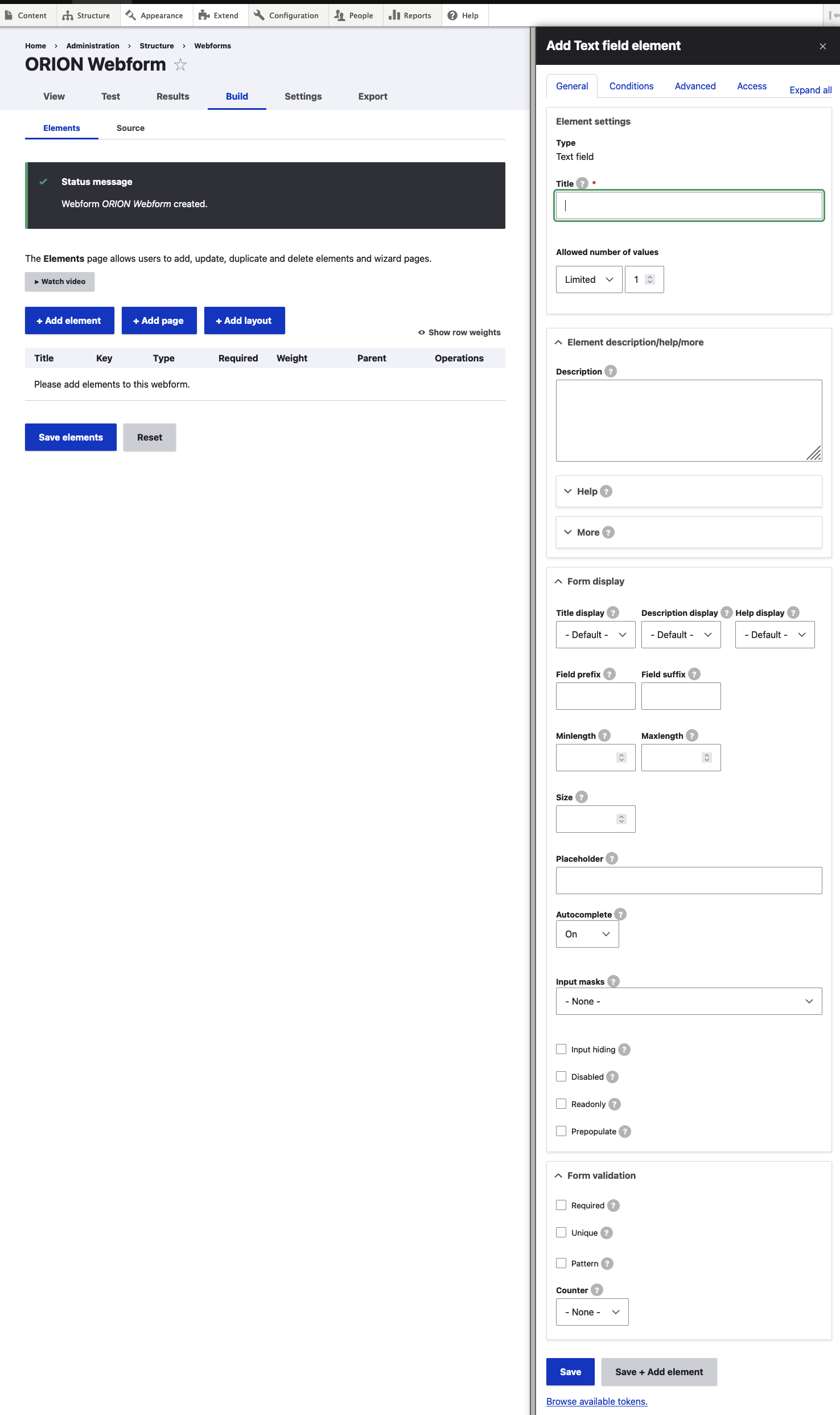
There are numerous settings and options available on this screen:
Element settings:
These are the primary settings for our field:
- Title: This is used as a descriptive label when displaying this webform element. For the purposes of this tutorial, we'll use this field to collect the first name of our users so we populate it with "First name".
- Key: This is the machine name of the field and it's auto-populated as you type the field's name. It doesn't have to exactly follow the name of your field - sometimes it's useful to add a prefix specific to the scope of your requirements so you can always click on "Edit" and change the default key to something more closely related to your user case.
- Allowed number of values: This refers to the number of values we want our users to be able to submit for this field. This is useful when we want to receive collections of data i.e. a selection of multiple options but we'll leave this to Limited - 1 as we are only after the user's first name.
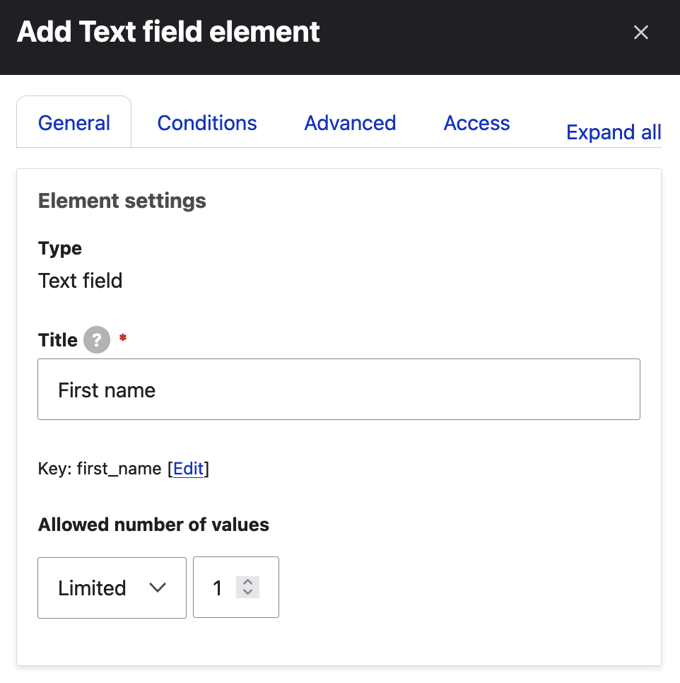
Element description/help/more:
This section allows us to add helpful information we want to display to our users. Simple fields like First name don't require additional help text but, for the sake of this tutorial, we've added some dummy wordings here so we can see how they render later:
Here's the list of the settings/fields available in this section:
- Description: A short description of the element used as help for the user when they use the webform.
- Help: Displays a Help tooltip after the element's title.
- Help title: The text displayed in the Help tooltip after the element's title (defaults to the element's title).
- Help text: The text displayed in the Help tooltip after the element's title.
- More: Displays a read more hide/show widget below the element's description.
- More title: The clickable label used to open and close more text (defaults to More).
- More text: A long description of the element that provides form additional information which can opened and closed.
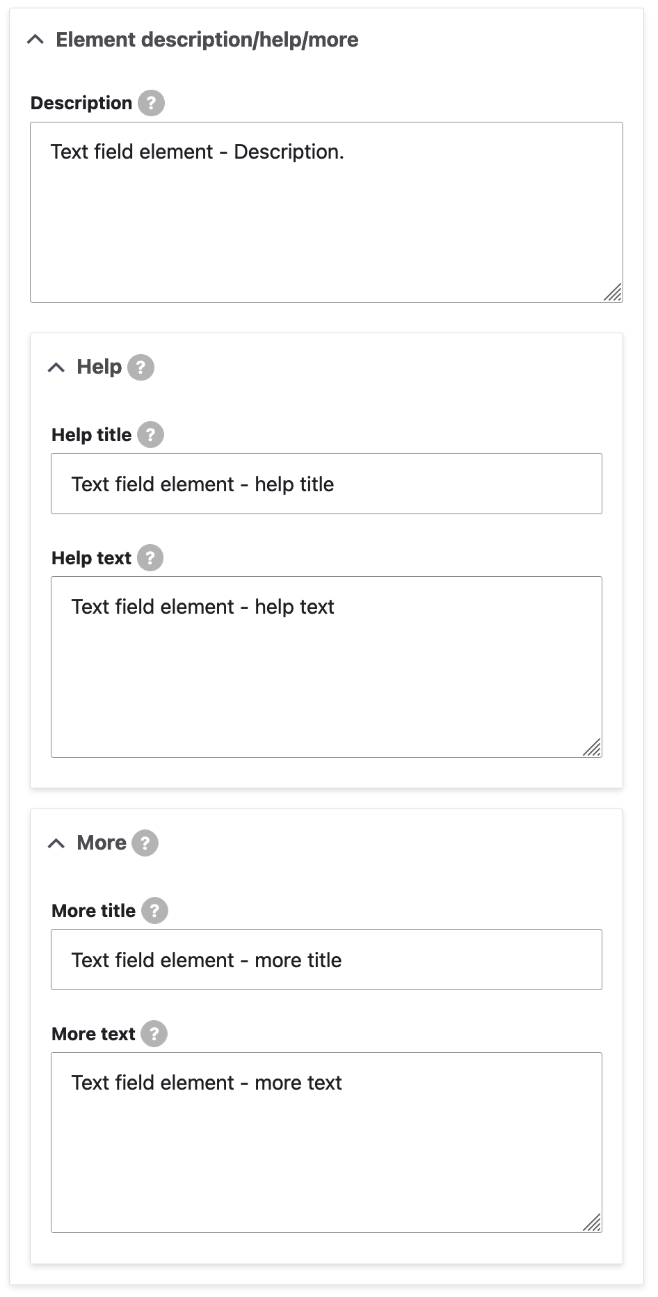
Form display:
These settings and fields are related more to how the form renders on the front-end.
Here's the list of the settings/fields available in this section:
- Title display: Determines the placement of the title relative to the field (possible values: Default / Before / After / Inline / Invisible / None). We leave this on the default selection.
- Description display: Determines the placement of the description relative to the field (possible values: Default / Before / After / Invisible / Tooltip). We leave this on the default selection.
- Help display: Determines the placement of the Help tooltip relative to the field's title or element (possible values: Before title / After title / Before element / After element). We leave this on the default selection.
- Field prefix: Text or code that is placed directly in front of the input. This can be used to prefix an input with a constant string. Examples: $, #, -.
- Field suffix: Text or code that is placed directly after the input. This can be used to add a unit to an input. Examples: lb, kg, %.
- Minlength: The element may still be empty unless it is required. For this field, we define a minimum length of 3 characters.
- Maxlength: Leaving this blank will use the default maxlength for this field type.
- Size: Leaving blank will use the default size.
- Placeholder: The placeholder will be shown in the element until the user starts entering a value. We have entered "Placeholder text" for this demo.
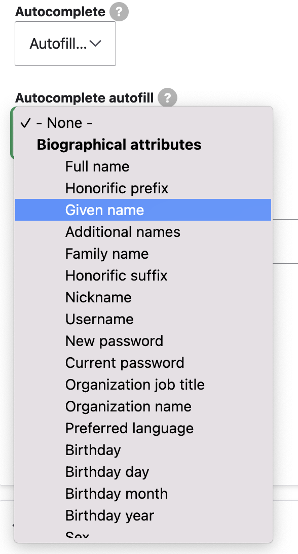
- Autocomplete: Possible values: On / Off / Autofill. For the sake of our example, we select 'Autofill'. Browsers sometimes have features for helping users fill forms in, for example prefilling the user's address based on earlier user input. The autocomplete (autofill) attribute can be used to hint to the user agent how to, or indeed whether to, provide such a feature. We select "Given name" for our First name element:
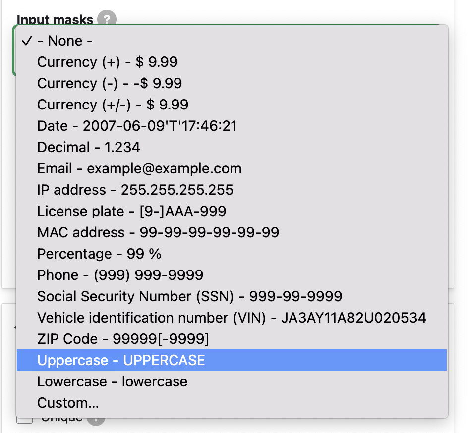
- Input masks: An inputmask helps the user with the element by ensuring a predefined format. This feature is making use of the inputmask Javascript library and for this demo's purposes we select "Uppercase - UPPERCASE":
- Input hiding: When this checkbox is ticked, the input of the element will be hidden when the input is not focused.
- Disabled: This checkbox makes the element non-editable with the user entered (e.g. via developer tools) value ignored. That can be useful for displaying a default value and the value is still changeable via JavaScript.
- Readonly: This checkbox makes the element non-editable with the user entered (e.g. via developer tools) value submitted. Similar to the "Disabled" setting above, that can be useful for displaying a default value and the value is still changeable via JavaScript.
- Prepopulate: This setting allows the element to be populated using query string parameters.
Form validation:
These options/fields allow us to add validation to our field. The simplest setting usually applied here is "Required" but more complicated ones - such as regular expressions - can also be used, depending on the requirements of the project. For our First name field, we have only really ticked "Required" but, in the screenshot below and to show you all the available fields, we display this section of the form with all options ticked:
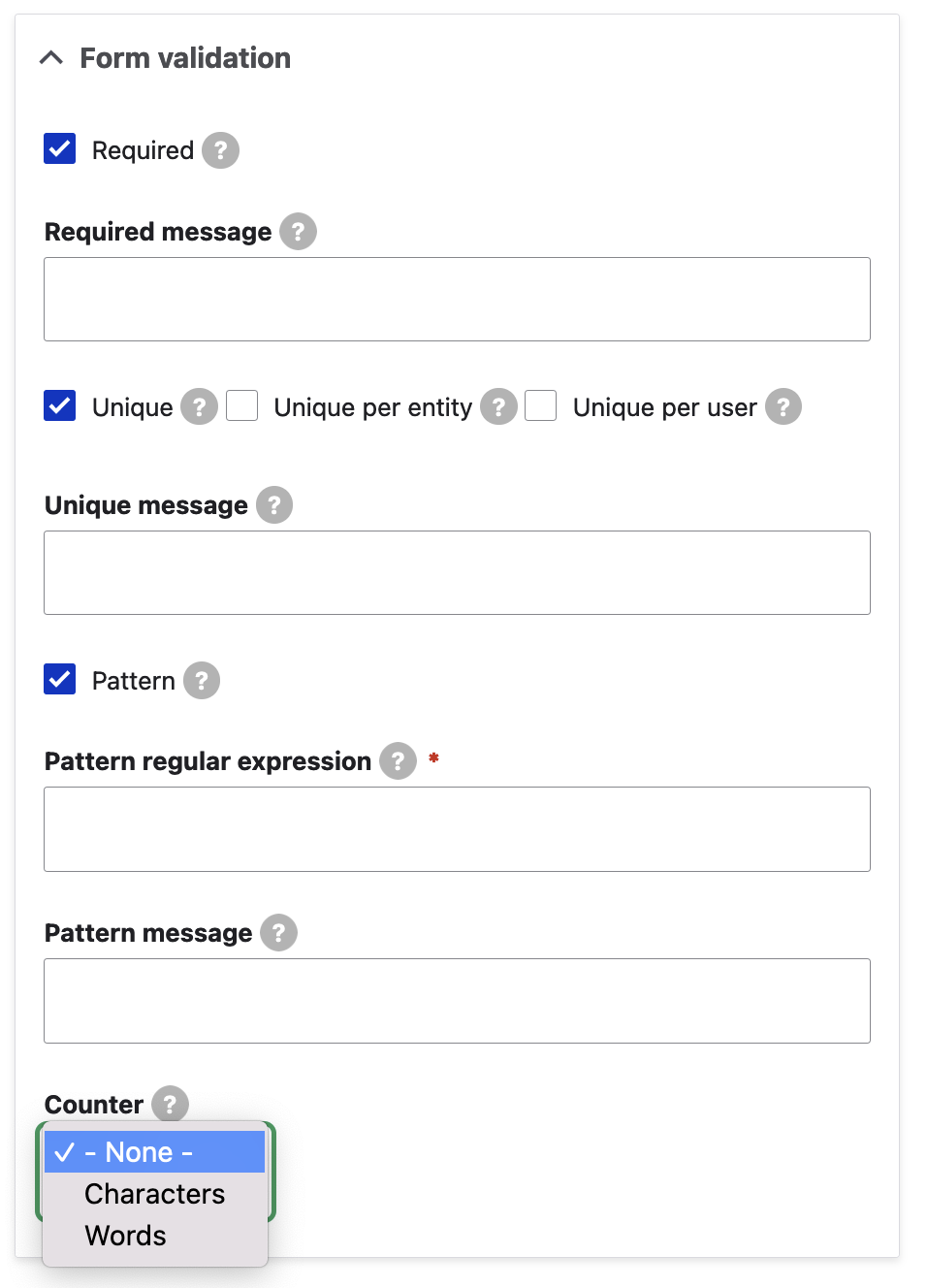
Here's the list of the settings/fields available in this section:
- Required: This setting allows us to choose whether this field is optional or not. If checked, a "Required message" text field appears. This message will be used when a required webform element is empty, instead of the default "Field x is required." message.
- Unique: If ticked, a check will run to ensure that all entered values for this element are unique.
- Unique per entity: If ticked, this option checks that entered values for this element is unique for the current source entity.
- Unique per user: If ticked, this option checks that entered values for this element are unique for the current user.
- Unique message: If set, this message will be used when an element's value are not unique, instead of the default "The value {VALUE} has already been submitted once for the {NAME} element. You may have already submitted this webform, or you need to use a different value." message.
- Pattern: This setting allows us to set a regular expression that the element's value is checked against. If ticked, the "Pattern regular expression text" field becomes visible, where we can enter our own regular expressions.
- Counter: This field allows us to limit the entered value to a maximum number of characters or words. Possible values: None / Characters / Words. We have not applied a counter for our demo First name field.
Upon saving the field form, we land on the webform's Build page (/admin/structure/webform/manage/orion_webform):
We can click on "View" to get a taste of how our webform looks like:
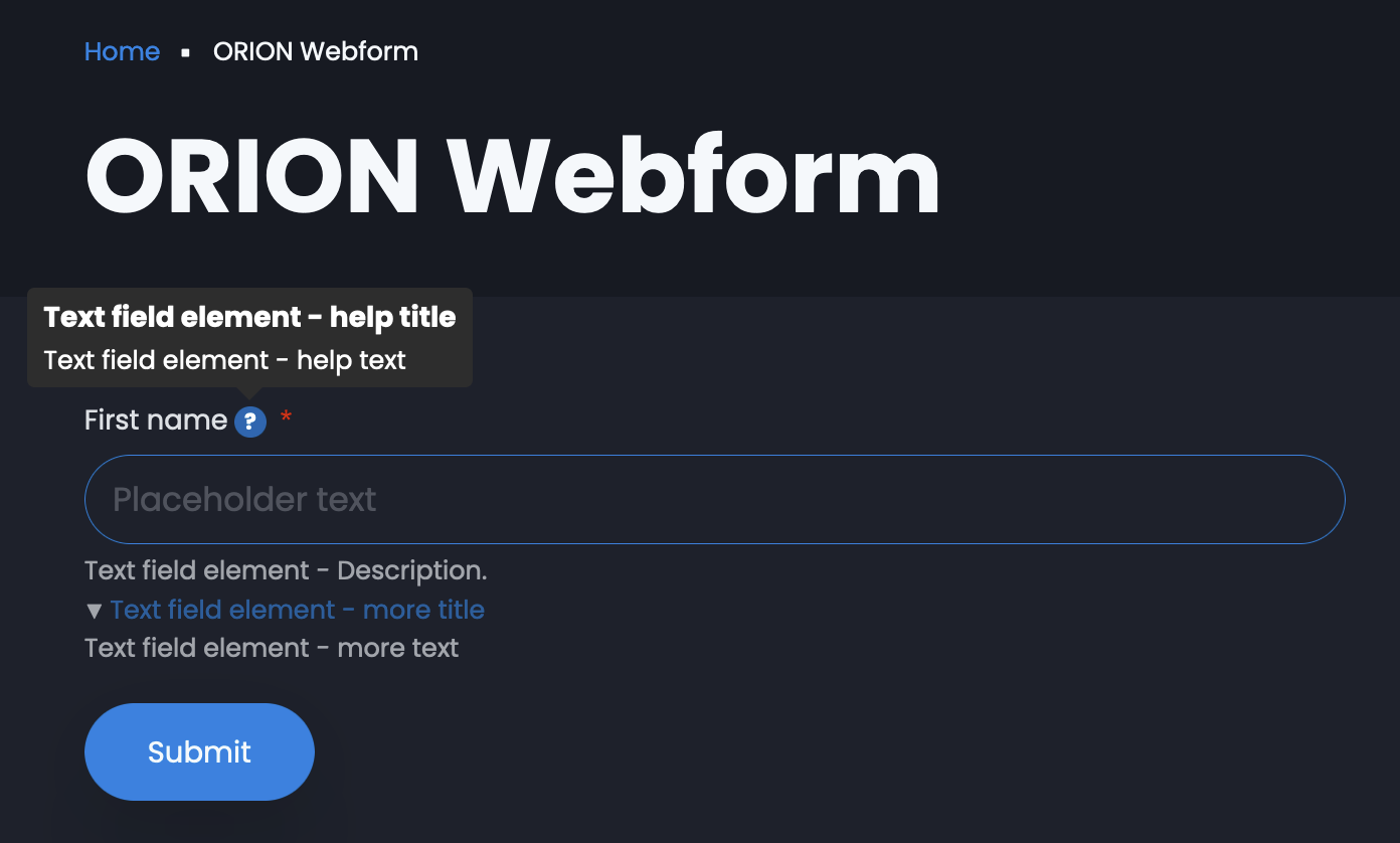
(For the sake of the screenshot, we've hovered over the field's help text icon to display the help title and help text wordings.)
Adding More Fields
Following the same workflow, we are going to add the following fields to our webform:
Field Type | Field Title | Field Key | Allowed number of values | Required | Comments |
|---|---|---|---|---|---|
Text field | Last name | last_name | Limited - 1 | Yes (ticked) | N/A |
Email address | email_address | Limited - 1 | Yes (ticked) | N/A | |
Terms of service | I agree to the {terms of service}. | terms_of_service | N/A | Yes (ticked) | Terms display: "Modal" Terms content text: "Demo terms content." |
Text area | Message | message | Limited - 1 | Yes (ticked) | Counter: "Words" Counter minimum: "10" Counter maximum: "500" |
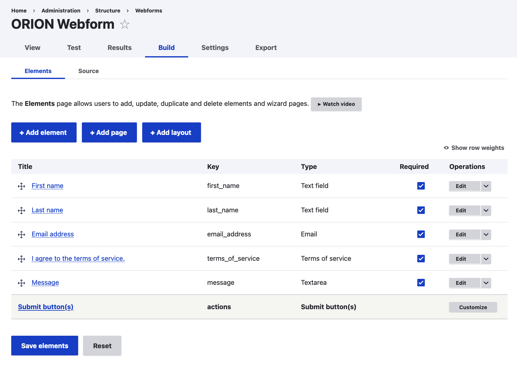
Following the addition (and saving) of these fields, the resulting Build screen should look like the following:
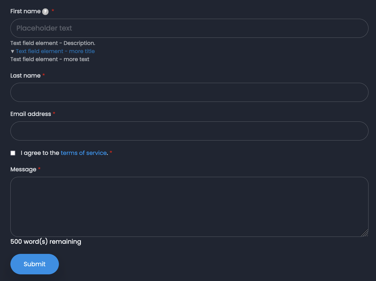
The resulting View screen looks like the following (your front-end theme will most probably look completely different compared to the theme used for this demo):
At any time, we can always go back to the Build screen of any webform (for our example webform the path for this screen would be /admin/structure/webform/manage/orion_webform) and view the fields it consists of. Clicking on the "Edit" for any field opens the element edit dialogue box on the right side of the screen.
We have explored the settings available under the General tab. We are going to have a closer look into the other element settings tab available for every field.
Additional Field (Element) Settings Tabs
"Conditions" element settings tab:
The conditions tab comes after the General tab/screen of settings for any Webform element (field) and provides the ability to add conditional logic between fields. This feature is making use of Drupal's States API. A "state" means a certain property on a DOM element, such as "visible" or "checked". A state can be applied to an element, depending on the state of another element on the page. In general, states depend on HTML attributes and DOM element properties, which change due to user interaction.
It is important to understand that all states are applied on presentation only i.e. on the loaded page and on the user's client (a web browser for example). None of the states force any server-side logic, and, as a result, they will not be applied for any of your site visitors without JavaScript support.
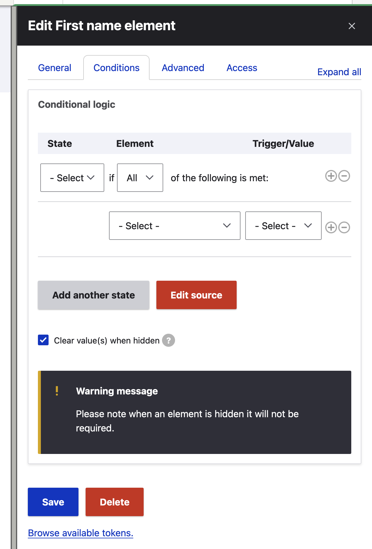
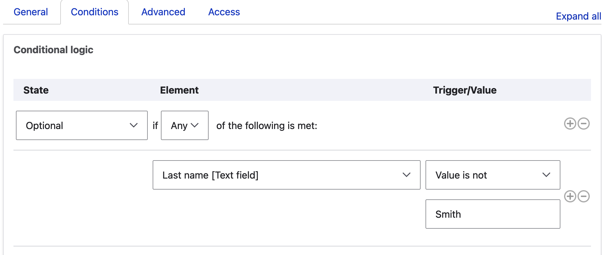
In the screenshot above, we are looking at the conditional logic for the First name field. In the "State" dropdown we have the following options:
Visibility:
- Visible
- Hidden
- Visible (Slide)
- Hidden (Slide)
State:
- Enabled
- Disabled
- Read/write
- Read-only
Validation:
- Required
- Optional
The states above describe resulting behaviours we want our "controlled" field to exhibit, based on certain conditions. For example, we might want a field to only be required when a checkbox field is ticked or a text area field is populated with text. Or we might need a field to be hidden at all times, apart from when another text field is filled in with a certain pattern of text. Countless combinations are possible and, at ORION WEB, we have never encountered a conditional logic scenario that can't be implemented using field states.
Every condition consists of the "controlling" field and the trigger (action):
- Empty
- Filled
- Checked
- Unchecked
- Value is
- Value it not
- Pattern (this accepts regular exceptions)
- Not Pattern (just like the trigger above, this also accepts regular exceptions)
- Less than (this works well on fields with numeric input)
- Less than/Equal to (same as above)
- Greater than (same as above)
- Greater than/Equal to (same as above)
- Between (same as above)
- No Between (same as above)
For example, a trigger could be a text field being populated ("Value is") with a specific wording, or a text field being filled in with a number "Greater than" 1000. Needless to say, upon selecting the trigger on the UI, we'll be prompted to add a value for the selected trigger. For example, we can set the First name field to not be required if the Last name field has been populated with any value but "Smith" (this scenario will probably never manifest in real life but it's perfect for the purpose of demonstrating how states work):
After we've set our states and "Save" the field, we can "View" the webform and confirm that our states work as expected.
We can also join conditions together with the following operators:
- "All": All conditions have to be met, at any time, in order for the state to be triggered
- "Any": One or more conditions have to be met, at any time, for the state to be triggered
- "One": A single condition (and no more) has to be met, at any time, for the state to be triggered
That way, we could fullfil scenarios like the following:
"Field C should only be visible IF Field A's Value is "X" AND Field B IS NOT Empty"
"Field B should be Disabled IF Field A's Value is Between 0 AND 10000"
Drupal's states add an extremely valuable layer of automation to webform implementations which would normally require custom code to be written instead. Make sure you try out different scenarios - it's always fun to see how a webform gradually becomes animated!
"Advanced" element settings tab:
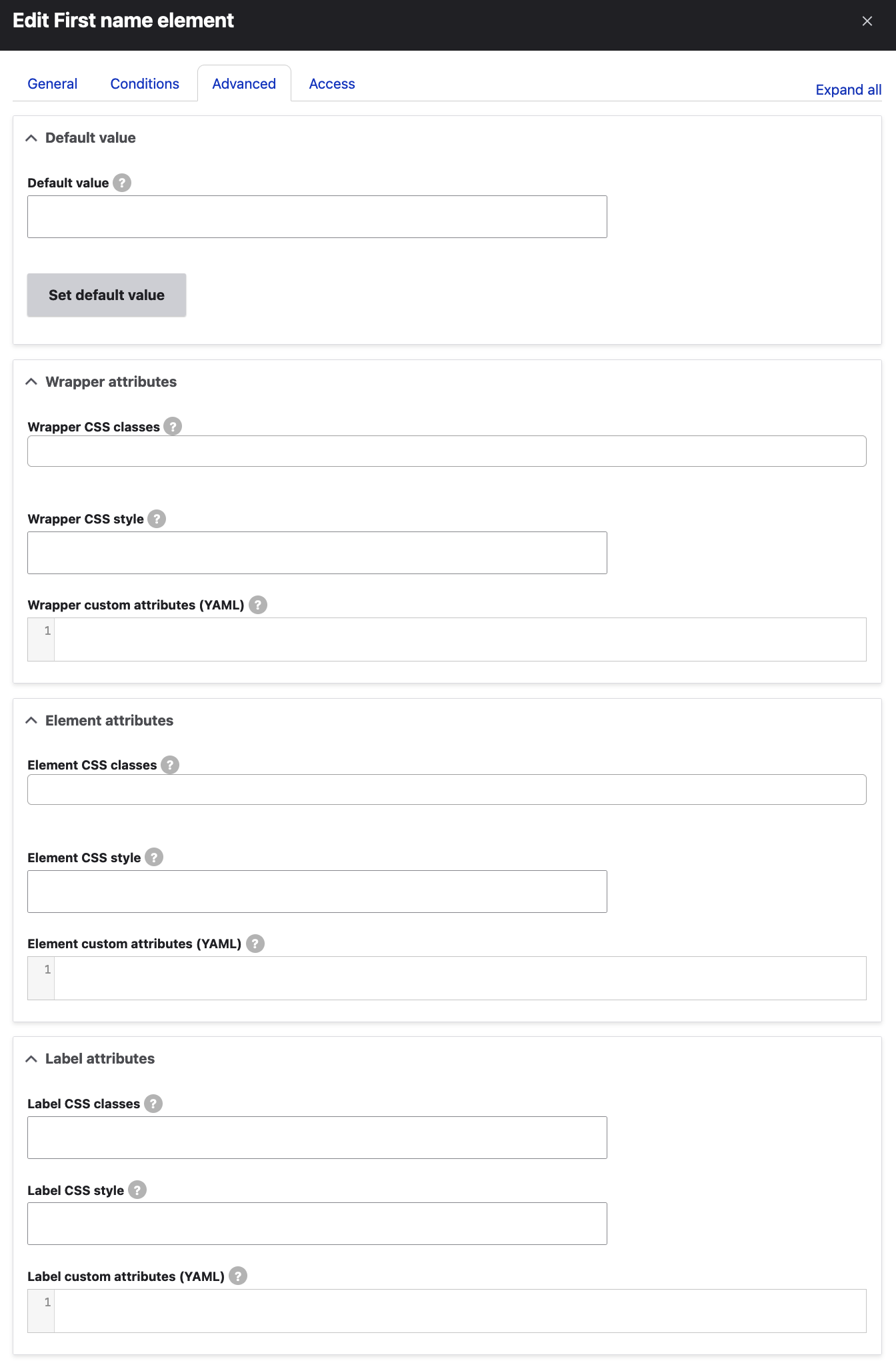
Moving on to the "Advanced" field settings, we can again control how our field will display and/or behave by setting certain attributes:
The first section allows us to define a default value for our field. This can be set for any kind of field that accepts value(s) from the user and it's really handy when we need certain value(s) to be pre-set for the user to leave as is of ammend. A field's default value will still be taken into consideration when any set conditions (as described above) get evaluated and the field will play its dynamic role accordingly - it'll either "control" another field (or set of fields) or be "controlled" by another field.
The additional sections (right below the Default value section) are mostly related to how our field will look like on the front-end i.e. whether we want to enrich its looks with additional styles and/or classes and/or additional attributes. Most of the time, there are three main sections here (some field types will have less settings available, for example Fieldset type fields only have Element attributes):
- Wrapper attributes:
- Wrapper CSS classes: This field allows us to apply classes to the element's wrapper i.e. around both the field and its label. We can also select 'custom…' to enter custom classes (these classes would need to exist in our theme's CSS files). This can be useful when we need a "special" style for one or more of our webform's fields that is slightly or largely different from the general theming of the form and its fields.
- Wrapper CSS style: This field allows us to directly add custom CSS styles to the element's wrapper i.e. around both the field and its label. The format here is the same as when we add inline CSS styles to HTML. For example, we could enter something like: padding:10px;.
- Wrapper custom attributes (YAML): In this field, we can enter additional attributes to be added to the element's wrapper. These have to follow the YAML syntax, for example, we could enter something like: data-custom: 'custom-attribute-value'.
- Element attributes:
- Element CSS classes: This, again, allows us to add classes to the element only i.e. not affecting its label. Select 'custom…' to enter custom classes.
- Element CSS style: Similarly to the Wrapper CSS style field above, this field allows us to directly add CSS styles to the element itself.
- Element custom attributes (YAML): Again, this field allows us to add additional attributes to the element only.
- Label attributes:
- Label CSS classes: This allows us to add classes to the element's label which would not affect the element itself.
- Label CSS style: Allows for adding our custom CSS styles to the element's label.
- Label custom attributes (YAML): Allows us to add additional attributes to the element's label.
Moving on, the "Advanced" element settings tab also includes the following settings (for most field types):
The following sections are included here:
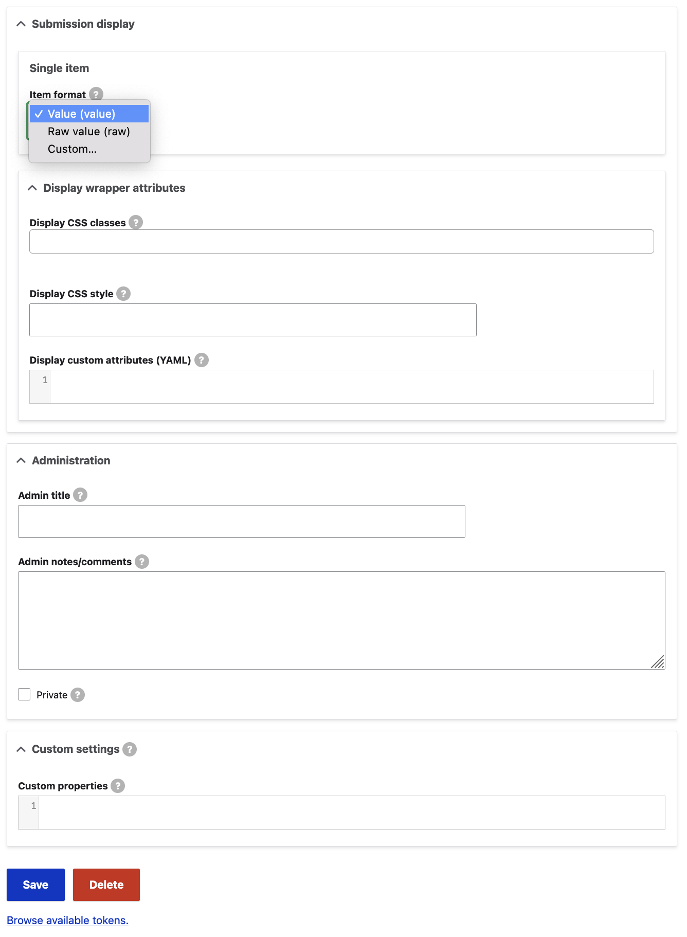
- Submission display: This section allows us to format the results of webform submissions i.e. provide a custom way of presenting the submitted data.
- Single item:
- Item format: This field allows us to select how a single value is displayed in the webform submissions. There are three possible options here:
- Value (value): This is the default setting and simply means that our field data will be submitted as is.
- Raw value (raw): This is similar to the above but it will remove any HTML tags from the rendered data for this field. For simple field types such as text or text area, this will have no practical effect.
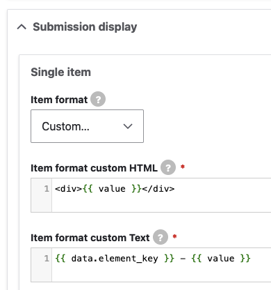
- Custom...: If we select this option, two additional fields become visible:
- Item format custom HTML: This is the HTML you want displayed for a single element value in the webform submission record. You can include custom HTML or Twig variables (Twig is the default theming engine that processes and prints your site's data on the front-end layer). You may enter data from the submission as per the "variables" presented lower on the page. For the sake of our example, we have entered <div>{{ value }}</div> which will merely render the data submitted for this field inside a div tag.
- Item format custom Text: This field allows you to set the text you want displayed for a single element value in the webform submission record. You may include Twig. You may enter data from the submission as per the "variables" presented lower on the page. For the sake of the example, we have entered {{ current_page }} which will print the current page path (where the submission came from, if a webform block is used in multiple locations throughout the website for example).
- Item format: This field allows us to select how a single value is displayed in the webform submissions. There are three possible options here:
- Single item:
Here are the Twig variables that can be used in the custom HTML and custom Text fields:
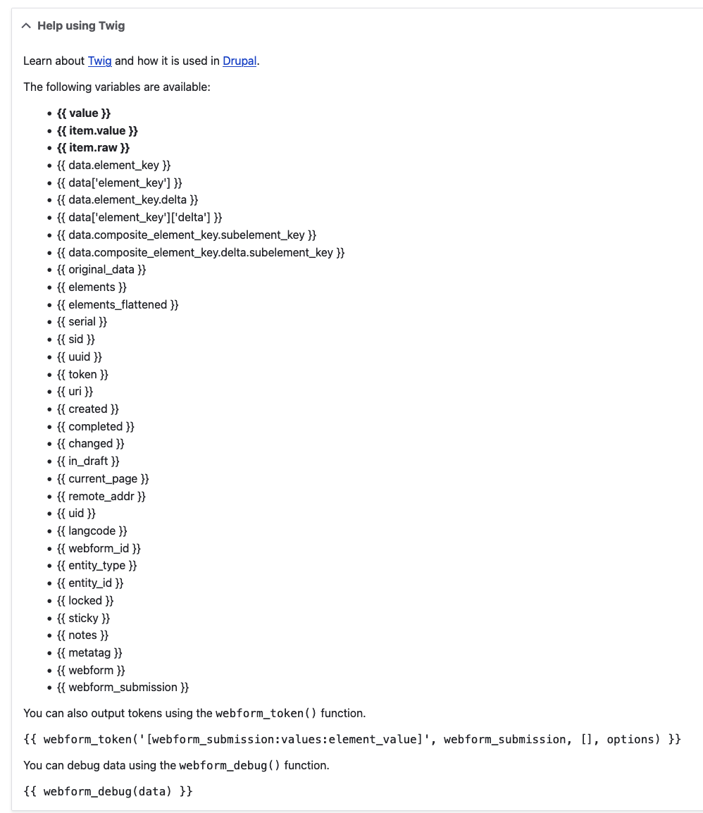
All of these variables, according to what their name suggests, represent piece of data related to the webform submission or a more broad context such as the site's language code, metatags or the current page.
You can read more about Twig, Drupal's default template engine in the following sources:
Let's move on and explore the remaining settings available in the "Advanced" element settings tab:
- Administration:
- Admin title: The admin title entered here will always be displayed when managing elements and viewing and downloading submissions. If an element's title is hidden, the element's admin title will be displayed when viewing a submission.
- Admin notes/comments: Admin notes/comments entered here will be displayed next to the element title in the form builder and visible in the form's YAML source (more about the YAML source below).
- Private checkbox: Private elements are shown only to users with results access (more about access below).
- Custom settings:
- Custom properties: Here, we can define additional properties that we want to be part of the webform element object. These properties will be returned when, most of the times in our custom logic, we call our webform field. You might already know that the hash (#) character is important in webform attributes. Properties defined here do not have to be prepended with the hash (#) character, as it will be automatically added. There are some reserved properties and callbacks that are not allowed in this field: #allowed_tags, #tree, #array_parents, #parents, #weight, #access_callback, #ajax, #after_build, #element_validate, #lazy_builder, #post_render, #pre_render, #process, #submit, #validate, #value_callback, #file_value_callbacks, #date_date_callbacks, #date_time_callbacks, and #captcha_validate.
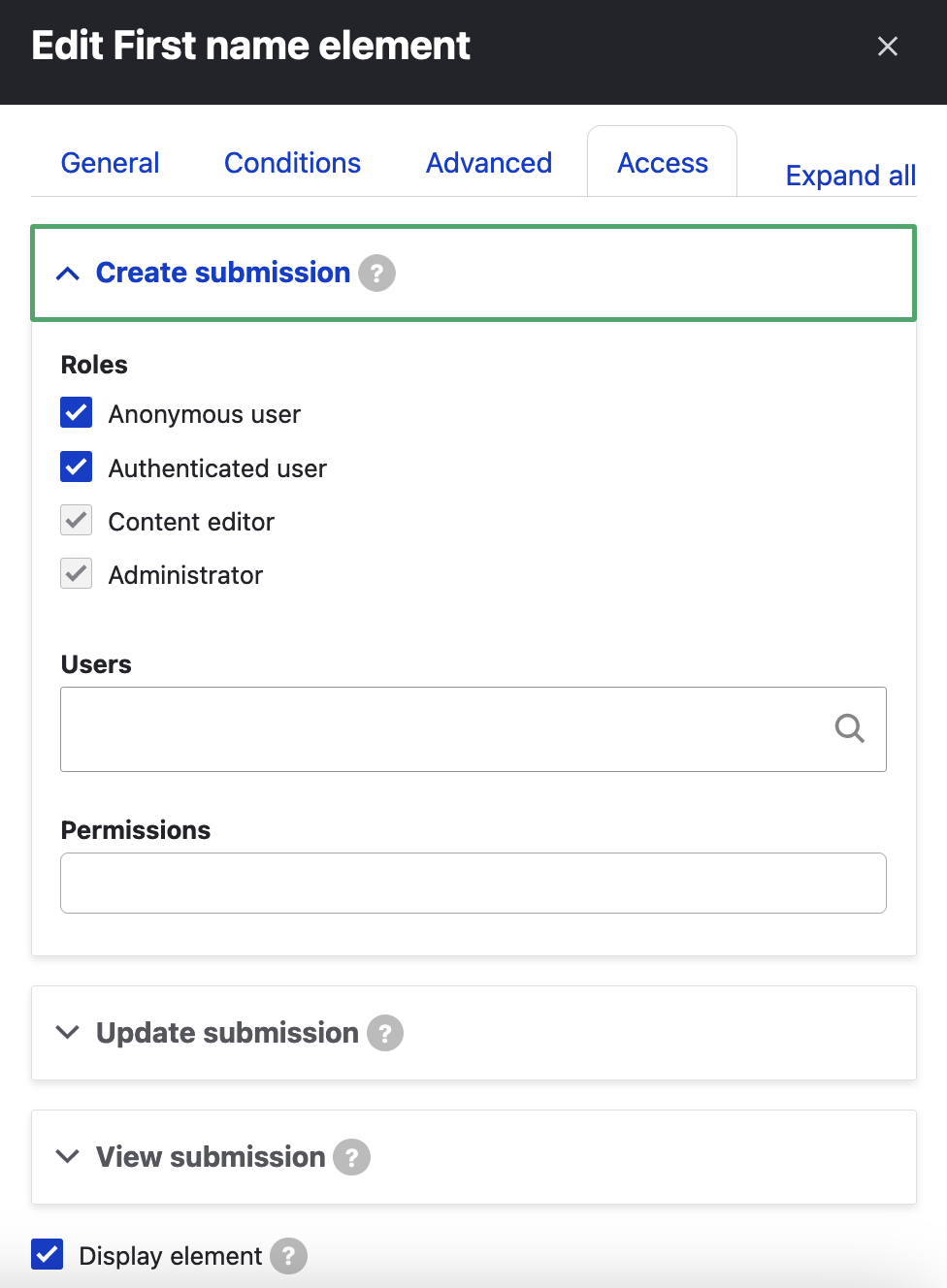
"Access" element settings tab:
The last tab of settings available to us when we edit a webform element has the following three main sections:
1. Create submission:
This section allows us to select roles and users that should be able to populate this element when creating a new submission. By default, all the existing roles of our website are selected, which means that this webform can be submitted by everyone.
We can limit this according to our requirements. For example, when a project demands only a certain sub-group of logged-in users to have access to a webform, this can be defined here. We can even add certain users registered on our website or even specific permissions a user should have in order to be able to access and submit the webform (all relevant permissions will be displayed in a list the second you focus your cursor in the "Permissions" field below):
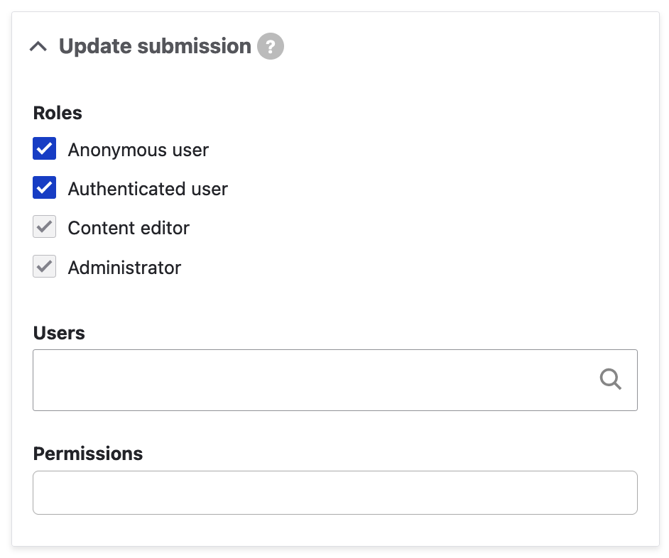
2. Update submission:
This section offers the same set of fields as the one above it ("create submission") and it allows us to select roles and users that should be able to update this element when updating an existing submission. In other words, this setting refers to the ability of, not only accessing submissions for the webform this element belongs to, but also, being able to change the data submitted for this element in the "parent" webform's submission records.
3. View submission:
This section allows us to select roles and users that should be able to view this element when viewing a submission for the webform this field belongs to and, as expected, it consists of the same set of fields as the two sections above it:
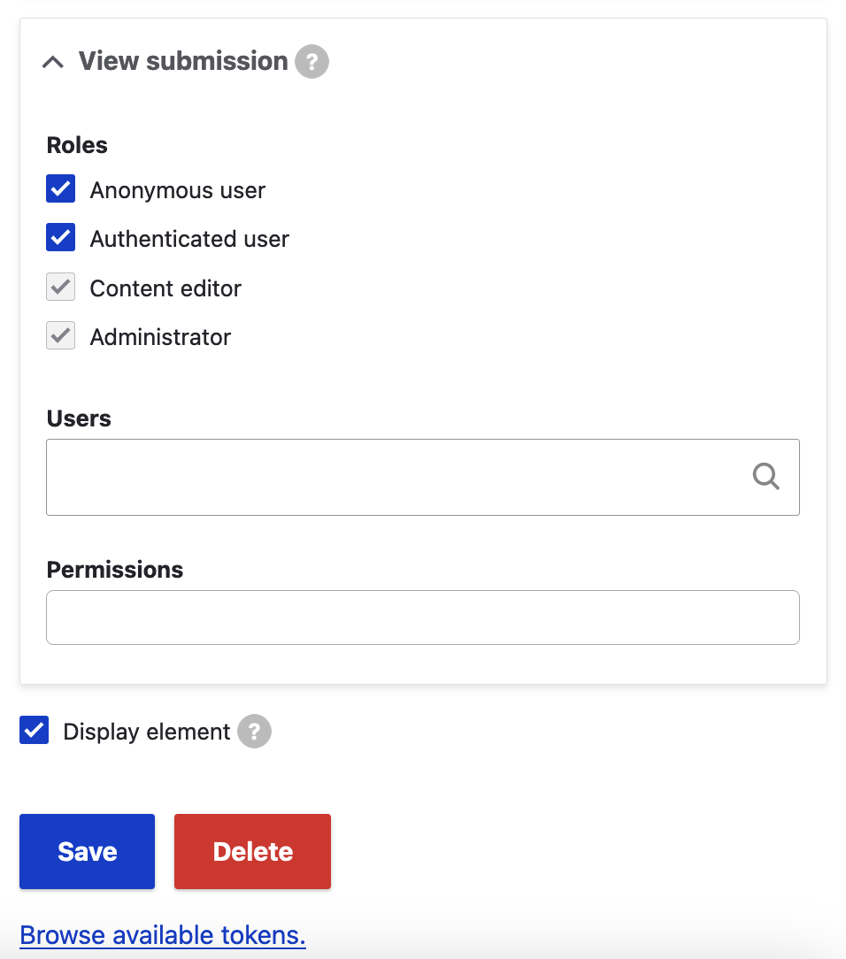
The last setting displayed at the bottom of the "Access" element settings tab is the "Display element" checkbox. If unchecked, the element will never be displayed and it will only be visible within the form builder and hidden from all other displays including submission details, results, and download. This can be handy when we are working on a field (as part of a minimum viable product (MVP)'s next phase for example) and don't want to display it publically in the current phase of our project.
This concludes the analysis of the settings and options available as part of editing an existing or creating a new field in a webform. In the next section, we are going to incorporate our webform into content!
Incorporating Webforms into Content
There are various method of displaying webforms in content and making them accessible to their target "audience":
1. Direct access to the Webform URL
By default, every webform can be access via its dedicated URL. This is automatically generated when a webform is first created and the setting that defines this behaviour is available on the Settings page of every webform. For our "ORION webform", that path would be /admin/structure/webform/manage/orion_webform/settings. On that settings page, the following section, URL path settings exists:
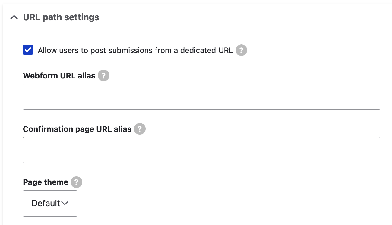
As you can see in the screenshot above, you can always set your own preferred URL alias for every webform i.e. override the default URL pattern assigned. This section also alllows us to set a custom confirmation page URL alias (which, by default follows the format /form/{webform-id}/confirmation?token={DISTINCT_TOKEN}).
Finally, the "Page theme" dropdown allows us to select the theme we want used to display any webform. The Default setting will use the front-end theme to render the webform.
2. Using the Webform content type
The Webform module comes with a large number of sub-modules. One of these sub-modules, Webform Node, provides a Webform content type which allows webforms to be integrated into a website as nodes.
With the Webform Node module enabled, under Structure > Content types (/admin/structure/types), we can now see the Webform content type and its settings are available under /admin/structure/types/manage/webform. Its manage fields screen (/admin/structure/types/manage/webform/fields) looks like the following:
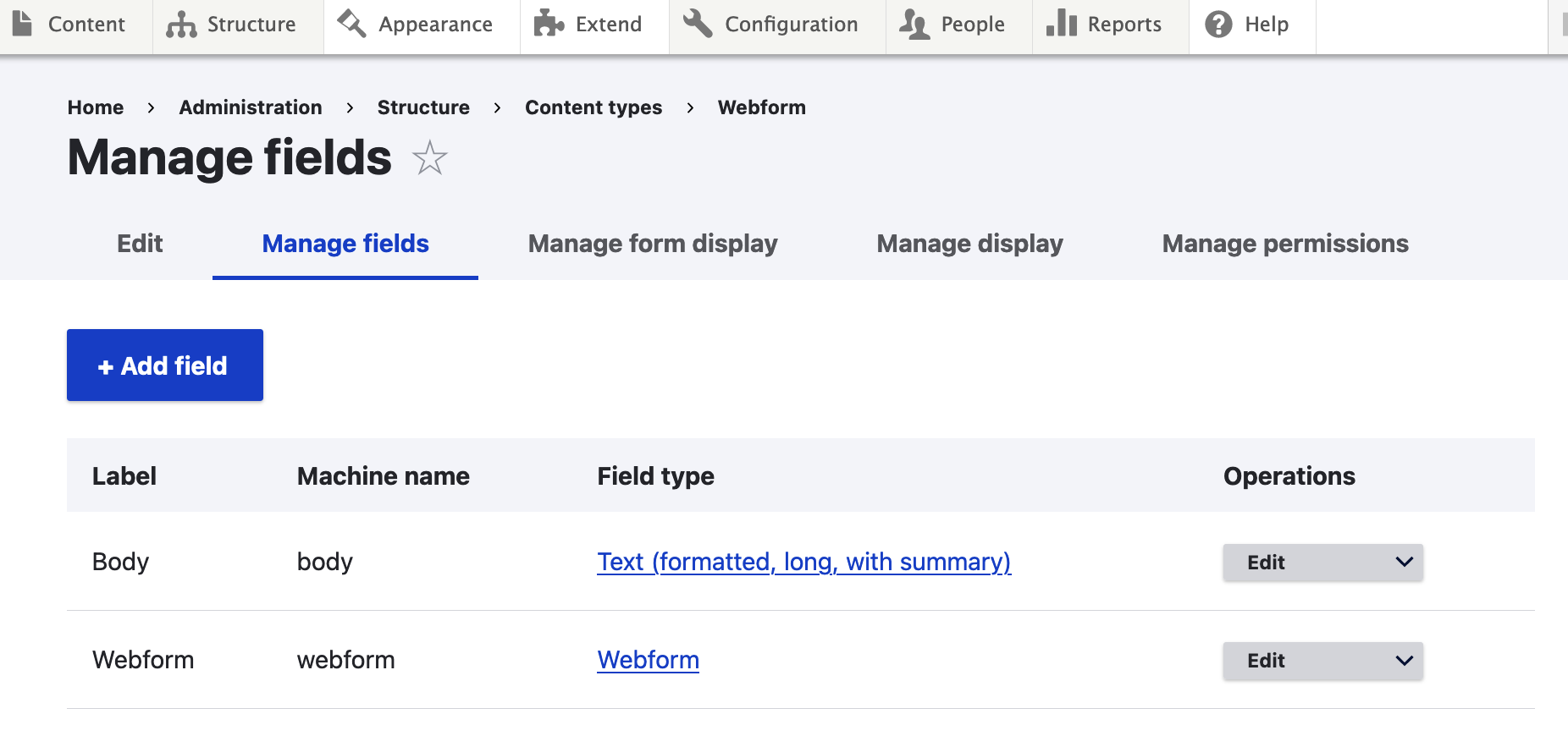
The second field on the screenshot above is of the "Webform" type and allows us to reference an existing Webform on our Webform nodes.
On the "Add content" screen (/node/add), we can click on the "Webform" content type to add a new node of this type. The Webform node add screen (/node/add/webform) looks like the following:
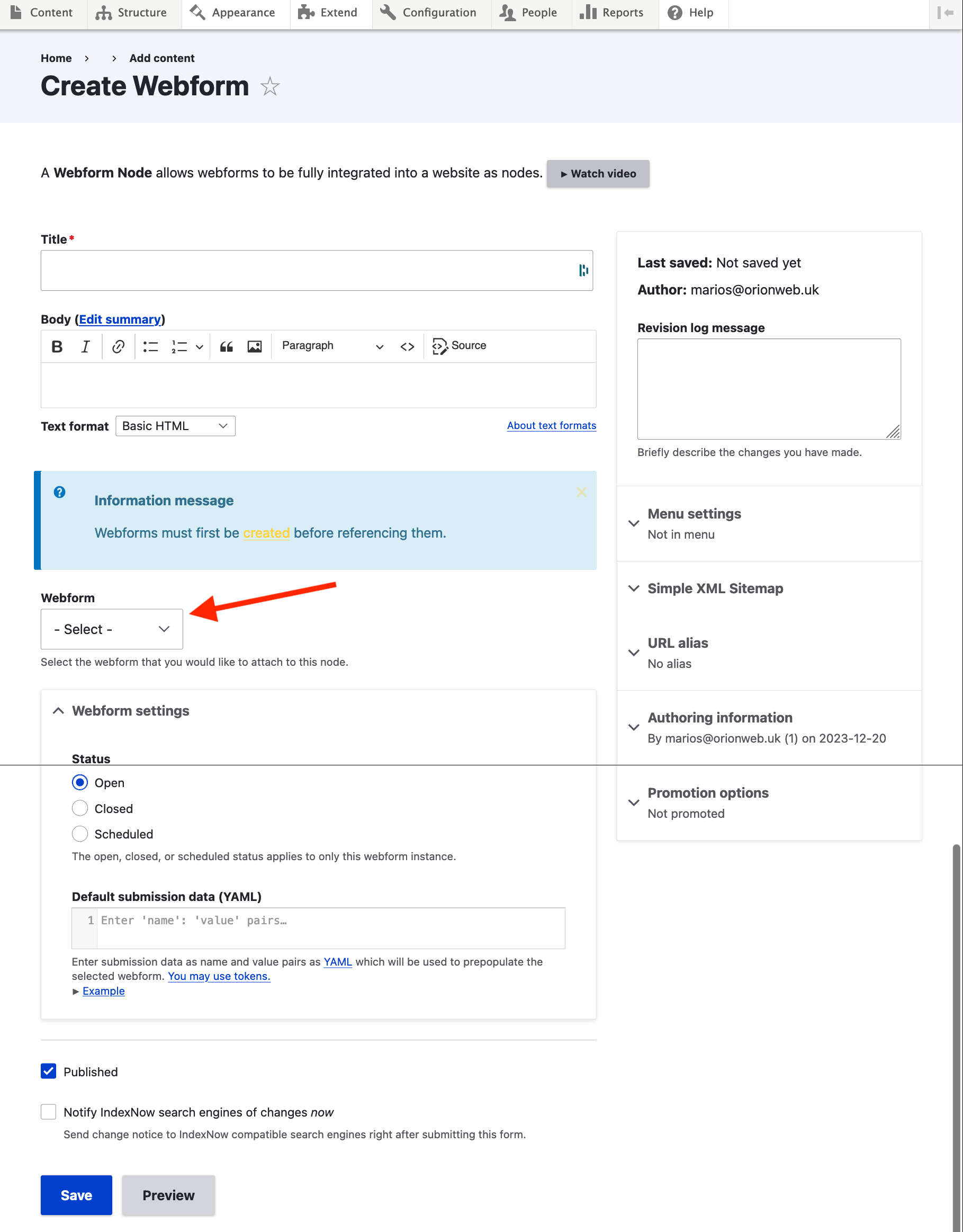
The Webform dropdown should now allow you to choose one of the existing webforms on the website. The Webform nodes behave like nodes of any other content type and can be configured (field settings, node form settings, display settings etc.) on the UI and also themed according to your project's requirements.
3. Attaching a webform to any content type
We can always use a different content type to attach our webforms to i.e. we don't have to necessarily use the Webform node content type described above. To do that, we'll have to add a new field to a content type of the "Webform" type. To do that, we select our content type of choice on /admin/structure/types and then click on "Manage fields" > "Add field".
For example, for our "Post" content type, here's how the field add screen looks like:
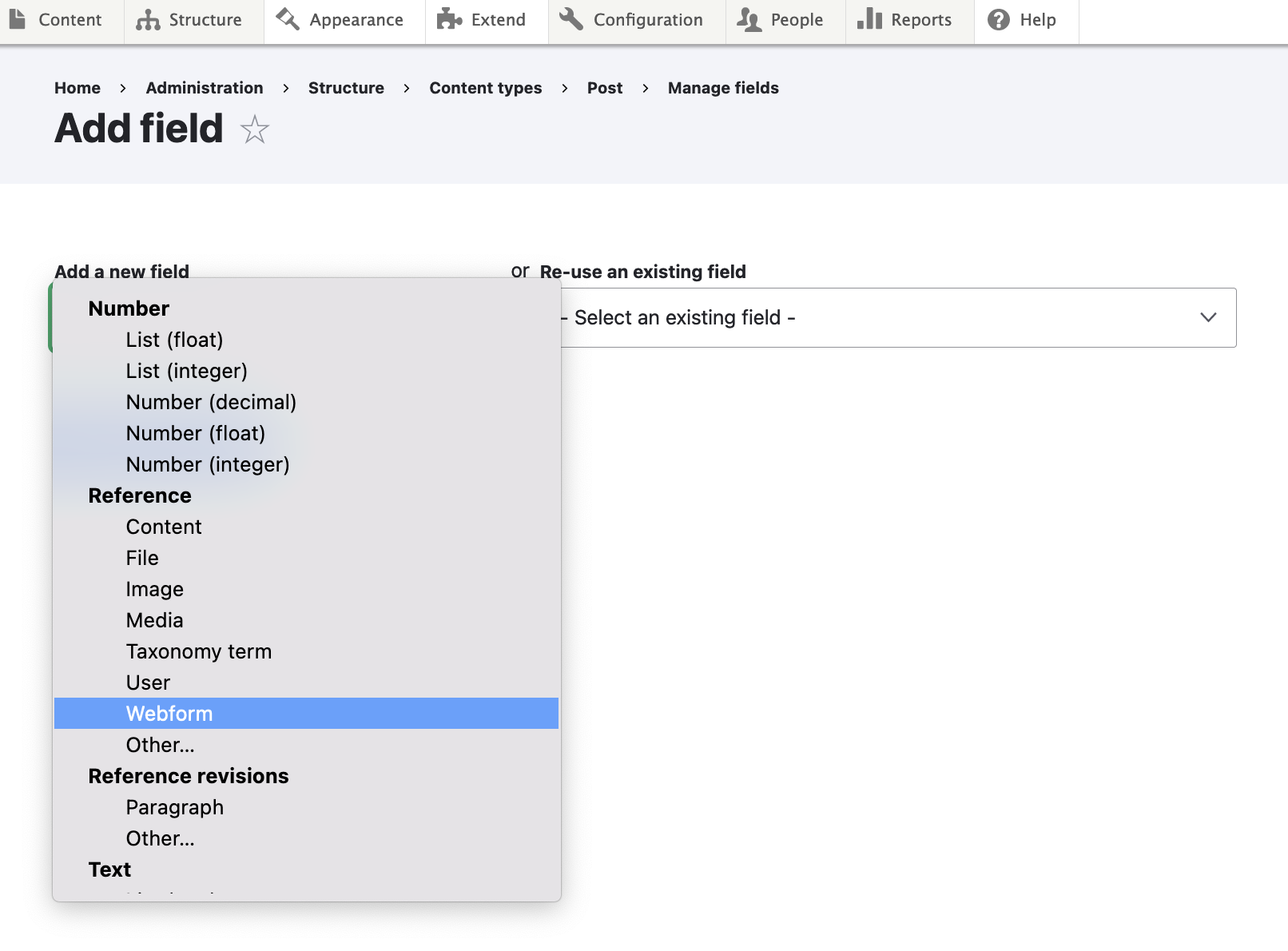
Upon selecting "Webform", we'll get the usual field settings dialogue from Drupal. You can select the defaults and save the field. Next time we edit this content type, we'll also get the newly added Webform reference field on the node add/edit form:
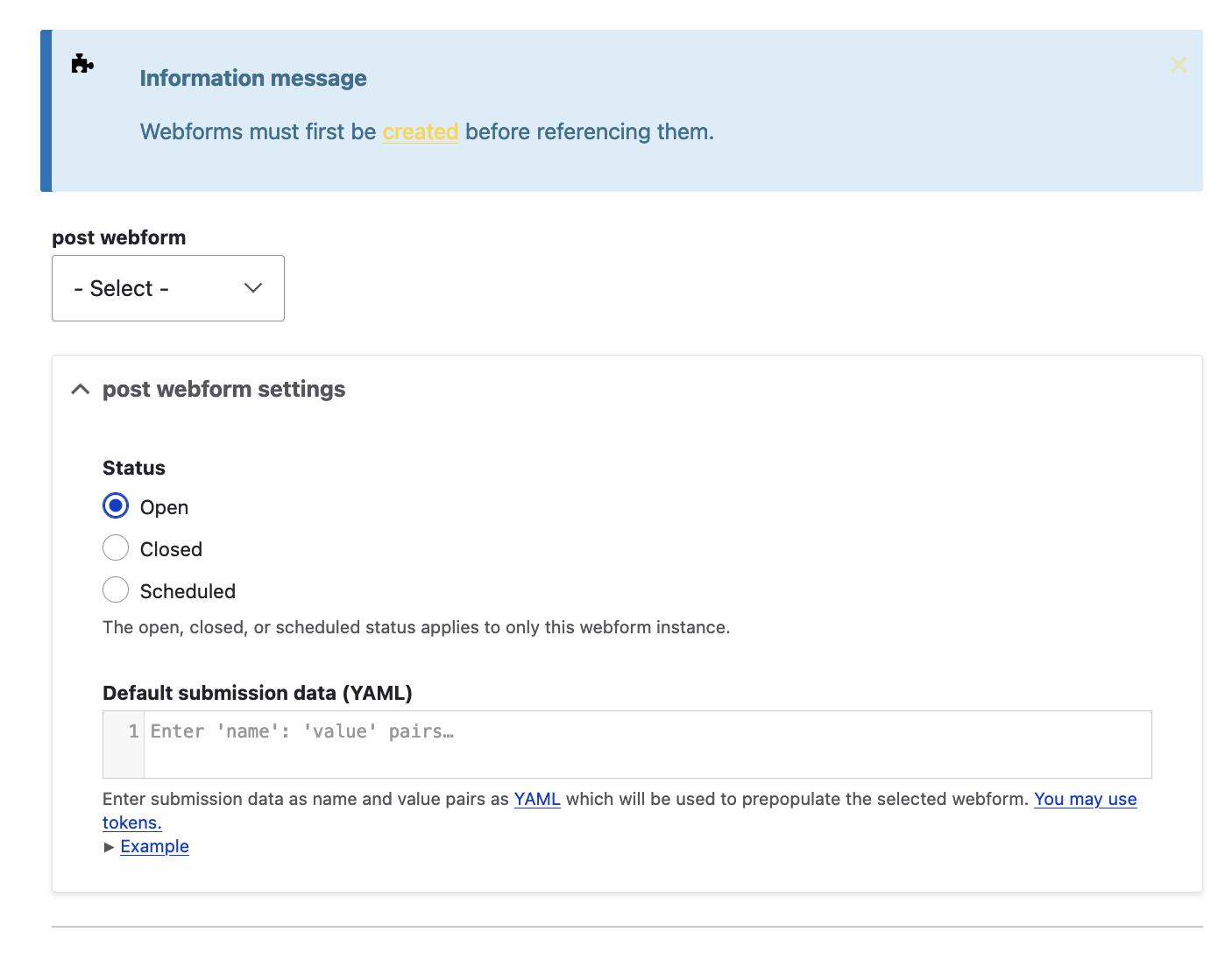
The dropdown at the top of the screenshot allows us to embed any existing webform and, below that, we are presented with a couple of handy settings that will affect only this embedded webform instance.
4. Attaching a webform to a block
To attach an existing webform to a block, we'll use the Block Layout screen available under Structure > Block Layout (/admin/structure/block). On that page, you'll see all the available regions for your front-end theme. Pick the region you want to add the webform block to and click on "Place block":
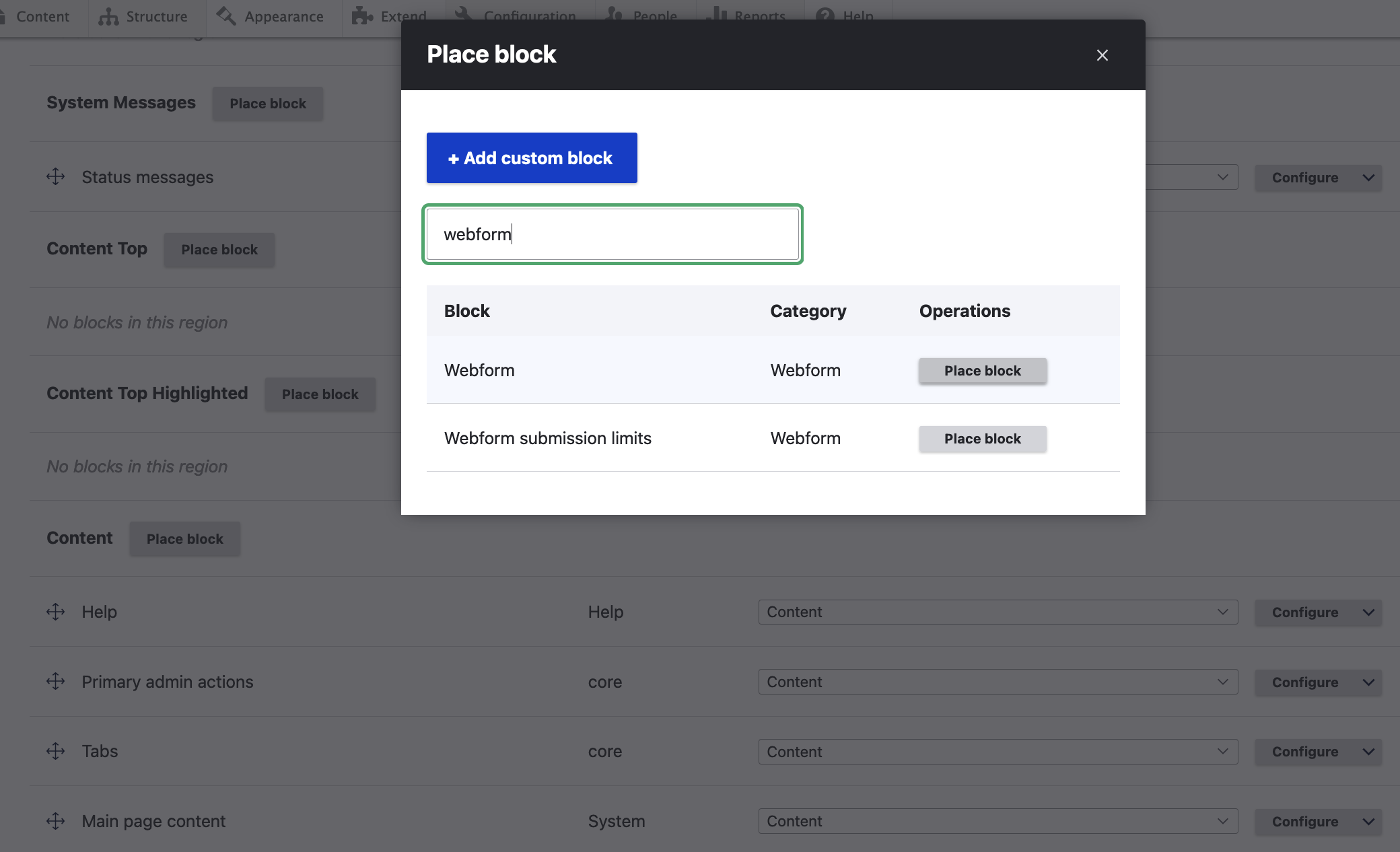
Type "webform" in the search field and then click "Place block" next to "Webform". This will open the "Configure block" popup window. Search for the webform you want to attach to this new block (in this case we've selected "ORION webform":
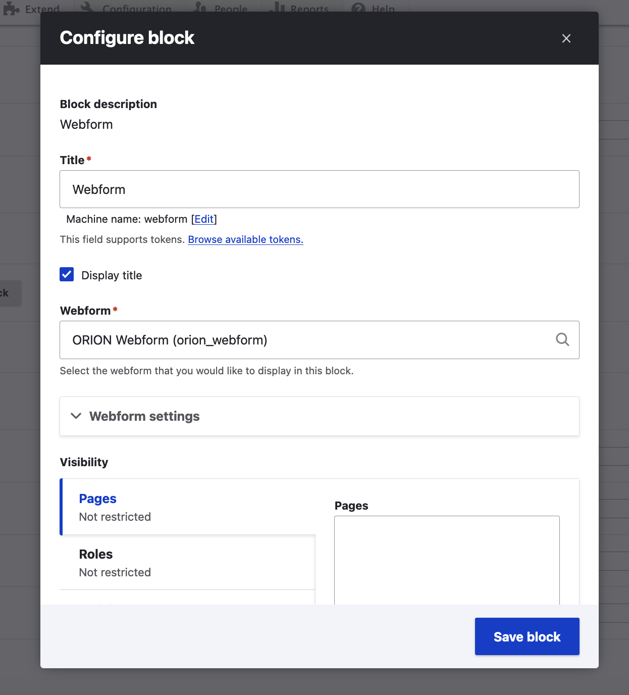
There are lots of available settings to configure here and similar settings exist for any type of block:
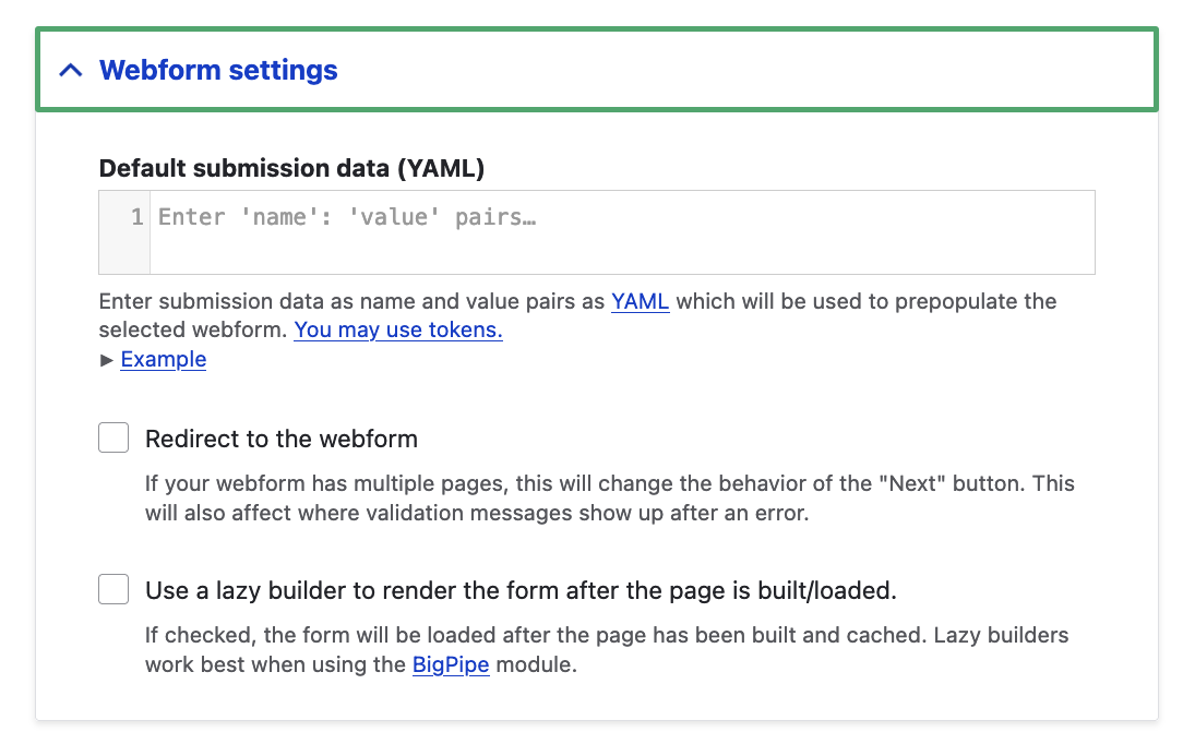
The "Webform settings" section offers the ability to define the structure of the submission data in YAML syntax (this is also available on the webform settings level).
Below this section, we have the classic visibility settings available for every type of block:
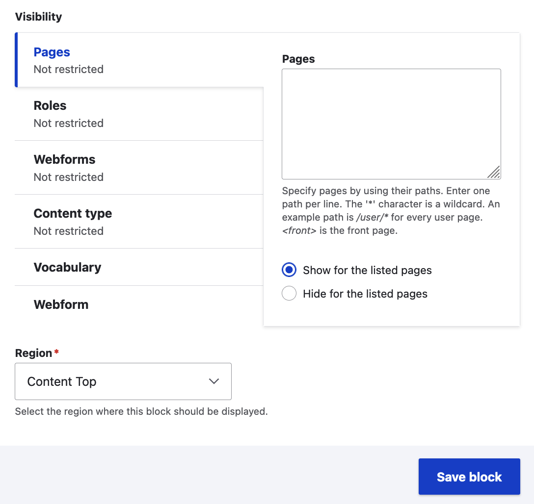
In this section, you can limit the scenarios where you want the block to appear by Page(s), User Role(s), Content Type(s) and Taxonomy Vocabularies. The two webform-related tabs, "Webforms" and "Webform" can be left with their default settings as this is a webform block and we are not intending to attach it to a webform (that could a weird loop of existence for our webform block!).
We then "Save block" and our webform block should now appear on the front-end and in the region we added it to!
Webform Configuration & Source
Drupal webforms are configuration entities which means that they can be exported to YAML files and this makes it easy to transfer a webform from one environment to another.
1. Webform Source YAML
For every webform, on the "Build" screen, we have the "Source" screen available right next to "Elements":
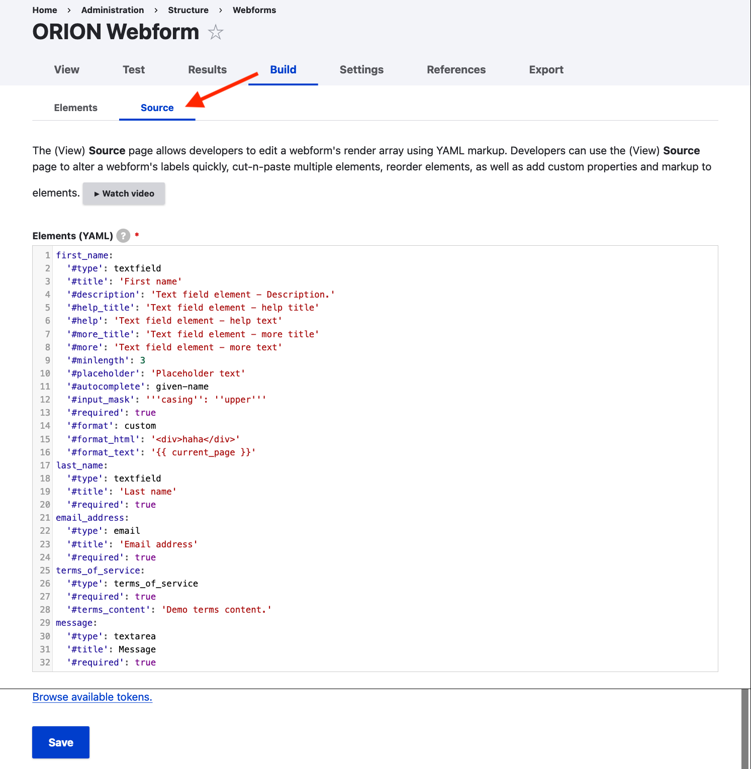
The "Source" tab displays the YAML file for the current webform. The syntax is human-friendly and easy to understand and, from observing a webform's source code in YAML, you can learn lots of things about the properties and building blocks of a webform (note the hashtag # symbol in front of every attribute). According to the message at the top of this screen, the (View) Source page allows developers to edit a webform's render array using YAML markup. Developers can use the (View) Source page to alter a webform's labels quickly, cut-n-paste multiple elements, reorder elements, as well as add custom properties and markup to elements.
1. Export & Import Webform Configuration
On the top level of every webform's settings, we can also find the "Export" screen:
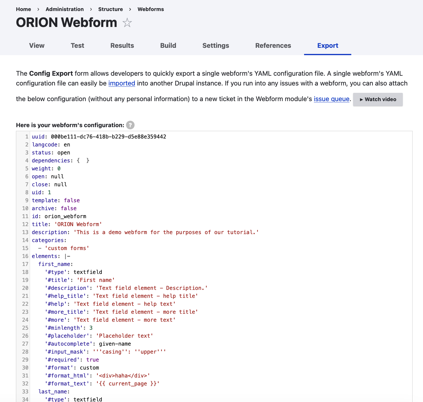
The configuration displayed here is a full representation of the webform object as it includes configuration-related properties such as the webform's distinct configuration uuid and the webform's properties (contrary to the YAML Source screen which primarily focuses on the webform's fields).
This screen basically allows developers to quickly export a single webform's YAML configuration file. A single webform's YAML configuration file can easily be imported into another Drupal instance, using the configuration import screen available under /admin/config/development/configuration/single/import?config_type=webform.
An example scenario for this would be getting (exporting) a webform's configuration from the live environment and importing it locally to work on expanding the webform and its features. The resulting (updated) configuration would then be re-imported as part of a deployment cycle and it would finally reach the live environment and refresh the webform's configuration with the updated version.
Webform Email Handlers
We've already covered the submission records available for each webform. Sometimes we need to immediately notify certain people in our organisation about submissions coming from a webform. Email handlers do exactly that and are available under /admin/structure/webform/manage/{WEBFORM_ID}/handlers for every webform on our site. By clicking on "+ add email", the corresponding popup dialogue box appears:
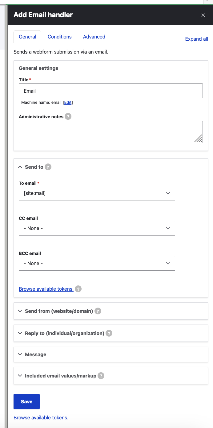
Numerous settings allow us to set up the following:
- Recipient email address(es) as well as CC and BCC email address(es)
- "From:" email header (includes email and name): This should be your brand, company, organization, or website entity.
- "Reply to": The email address that a recipient will see when they replying to an email.
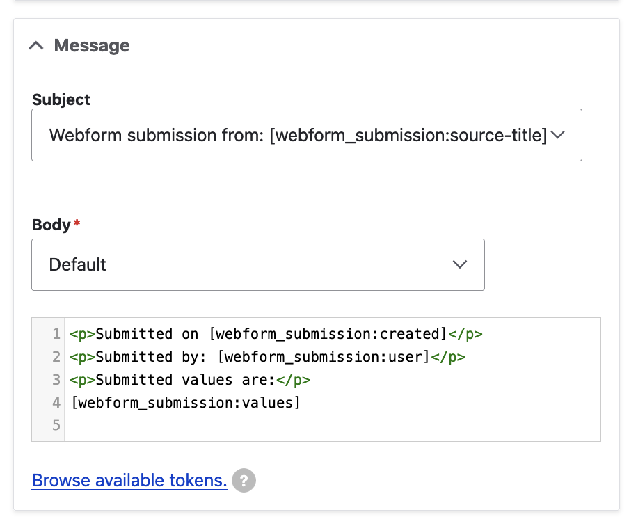
- Message - this allows us to customise the subject and body of our webform's email notifications:
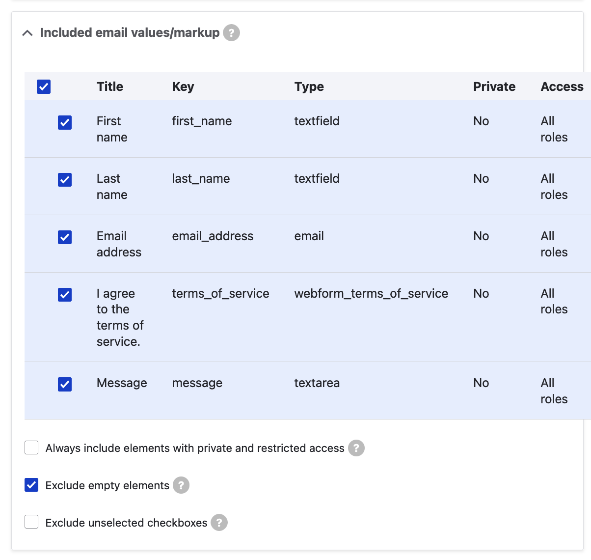
- Included email values/markup: The selected elements in this section will be included in the [webform_submission:values] token. Individual values may still be printed if explicitly specified as a [webform_submission:values:?] in the email body template:
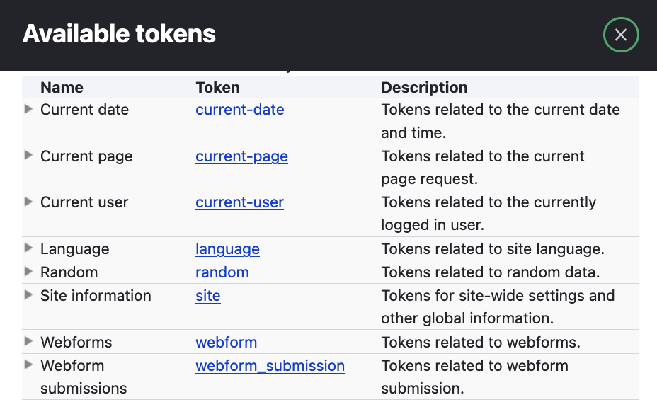
Most of the settings above are token-friendly and some of them already have tokens as default values. As a refresher, tokens are placeholder variables and as records are displayed, contextual values are replaced, such as [current-date:medium] or [site:name]. This means that, in the fields described above, we can use tokens from the corresponding popup ("Browse available tokens") and that way, we can enrich our webform submission results' emails with additional information:
Conclusion
We have managed to create a brand new webform, populate it with fields, configure it according to our requirements and display it to our users - from here, the sky is the limit!
The Drupal community has gone a long way with repairing issues and enhancing features and, as a result, most common scenarios should always be covered by the "out-of-the-box" functionality of the Webform module. You can always further develop your webforms and create more beautiful experiences for your site's visitors.
ORION WEB can help you design, build and configure beautiful user journeys. Contact us for a free consultation - we'd love to discuss your organisation's digital strategy!